Logo Design for the Retail Company
The client was a company from Winnipeg supplying premium brands in top-tier tactical and protective products crafted for the police, emergency, military, and security fields 👩🏻🚒👮🏻 The client wanted to open a new line of outdoor products and needed a logo for this direction.
The first stages of the design flow were standard. I researched the all company’s product lines and local competitors and emphasized the key visual and business features of the brands. I don’t want to give a lot of details about routine tasks and focus more on the most challenging aspects of the project.
There were 2 of them:
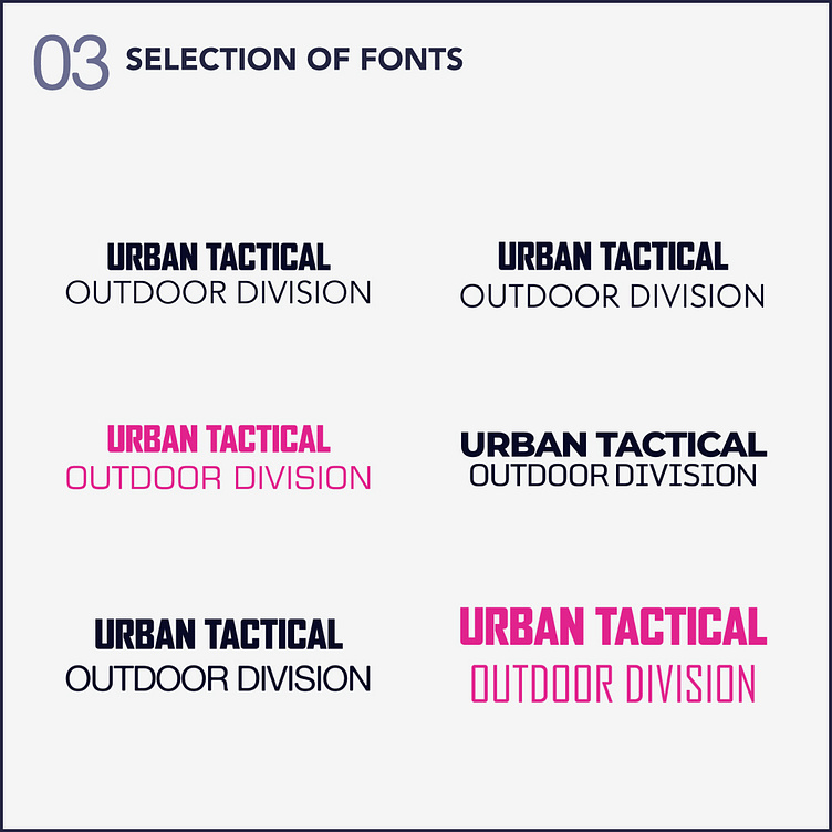
🉐 Font selection.
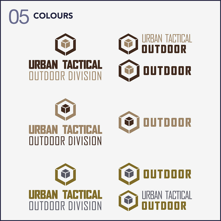
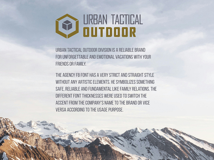
I had 2 opposite concepts about the font view. Make the Outdoor brand font round and contrast to the main font. On the other hand, the straight narrow font with sharp angles will save the coherency of the logo to all other brandlines. After several iterations of the font selection, I decided to move forward with the second variant.
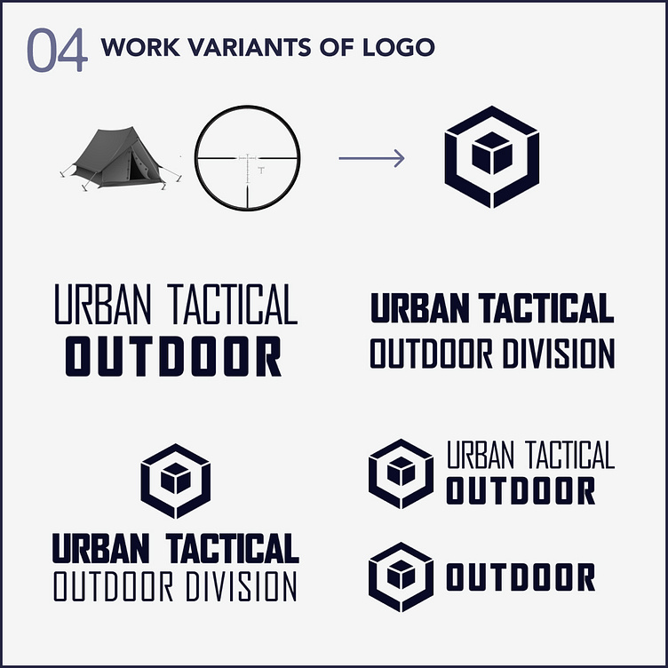
🎯 Design of the graphic element.
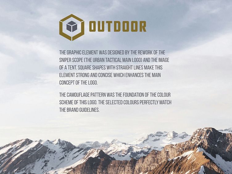
The simple notion came to mind to use for the design symbols related to the military and outdoor themes. I chose the sniper scope and tent. During the design stage, I simplified and transformed them into polygon shapes. It took around 1 hour to find a magic trick to unite those shapes. That trick was to centre shapes one inside another and put an inverted sniper scope grid on top of them ✨
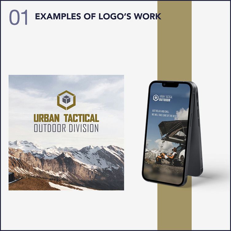
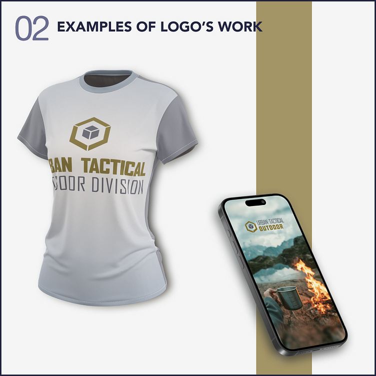
The finishing touches were creating the colour palette from the camouflage colours and testing the different cases of usage of the logo for different platforms. When I started to design mockups with the freshly designed logo, I was deeply admired and inspired by how the logo design process transformed into the creating brand with its values and visual identity 😍
📲 Shoot me a message in DM if you need to design an authentical standing-out logo for your business or project.