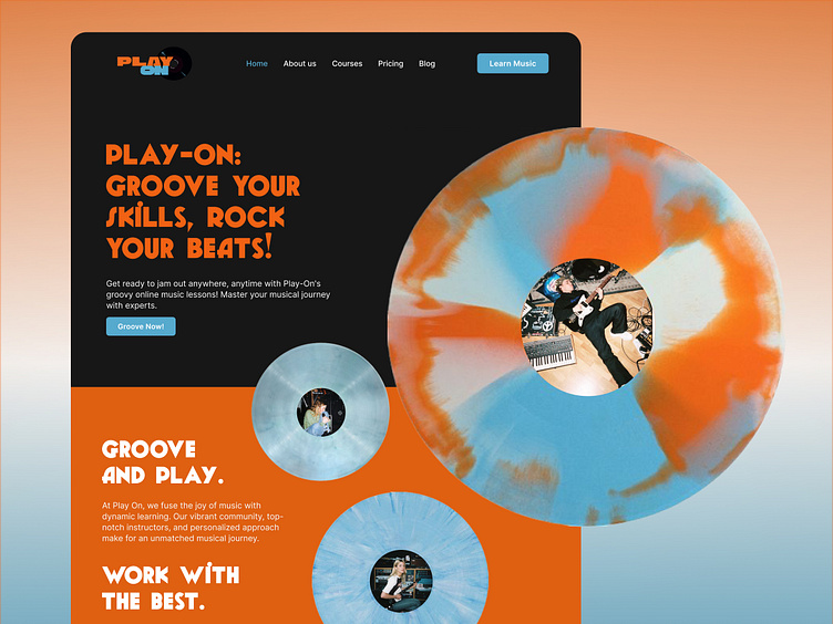
Retro-Inspired UI for an Online Music Academy 🎸🎶
Excited to share my latest project with you all: Play-On Music Academy's retro-inspired UI design! 🎸
This time the creative process took a turn, as the objective was to blend retro vintage vibes with a modern flair. It began from crafting funky landing pages, to expanding the design and UI aesthetic into app interfaces.
Check out the retro groovy design! 🎵
Play-On Online Music Academy Website
This creative journey began with an essential step, a funky mood-board, capturing the essence of retro music scenes. From there, I delved into designing a concept that was not only fun and groovy but also immersive and engaging.
Throughout the process, experimentation with element superposition techniques and playful imagery brought the vision to life, though not without its fair share of starting the design from a new. With each draft, the design kept evolving, finally reaching to the core vision of a combination nostalgic retro music while ensuring an intuitive user experience.
Play-On Online Music Academy App UI
Drawing inspiration from top-notch sites and apps, the goal was to improve upon existing standards while infusing our unique retro charm.
The App UI design features a sleek calendar screen for easy session browsing, a discover screen for filtering through classes, and a detailed course description screen to aid navigation.
Once a lesson is selected, users are seamlessly guided through a module screen combining video and written material for enhanced learning. And to keep track of progress, the user progress screen offers a comprehensive view of courses and completed lessons.
Meet the Designer Behind Play-On! 🎸🎶
Hey, I'm Alicia Climent! Thanks for making it till here! I´m the creative mind fuelling the design magic at the project Play-On! 👋✨
📱 Social Media:
Email: aliciacliment@hotmail.com
LinkedIn: Alicia Climent Barahona
Instagram: @alicliment_
And that's my latest design experience on with Play-On! From conceptualization to the final design, this project is dedicated to empowering students on their musical journey. As the designer, my mission was to make music education more accessible and enjoyable, while ensuring the platform remains user-friendly and engaging.
What's your take on it? I'd love to hear your thoughts and feedback! Whether it's a comment, suggestion, or just a hello, your input matters. Thank you!


