A nutri | Nutrition Group

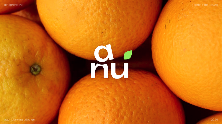
A nutri
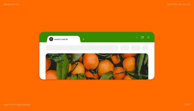
This project gathers Brazilian nutritionists to share nutrition to the whole world with videos, cooking recipes and learning content, while also offering worldwide online support.
The brand was inspired on colorful dishes, Brazilian food and on the professionals joy and communication.
Challenge
Bring nutrition lightly and joyfully.
Researches show that people have higher chances of giving up on a diet when they need to prepare complex meals. Besides, they also point out that diets with food/ingredient restrictions are less effective than those with a variety of beans, vegetables, and proteins, which brings satiety, rich nutrition, and satisfaction.
Our challenge here was to bring healthy food to the visual identity, at the same time making a controversial theme look fun and relaxed.
Creation
As a foundation for this logo, we have used the following words:
• Food
• Leaves
• Fun
• Flexibility
Colors
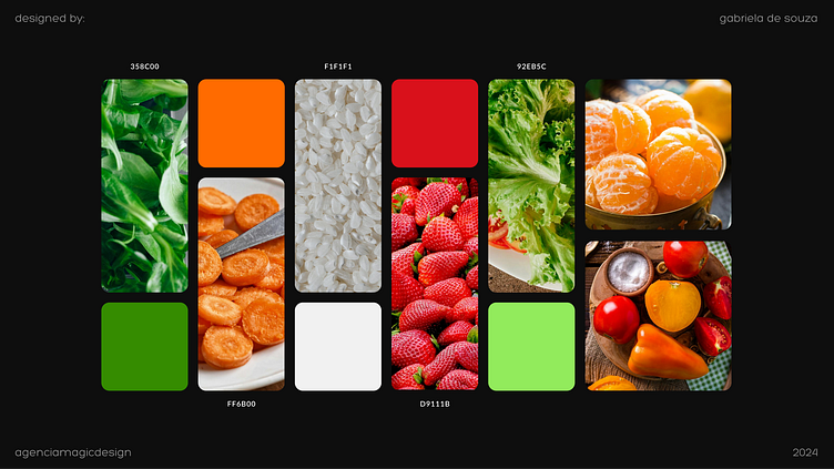
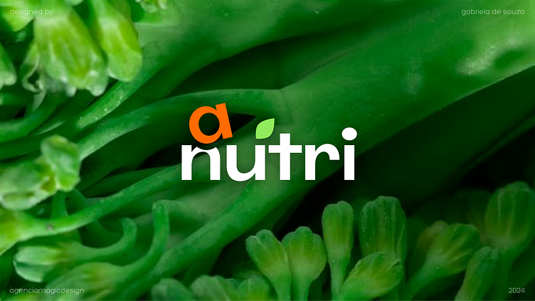
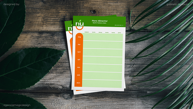
Colors were inspired by leaves, beans, vegetables, and fruits, reinforcing taste and freshness, which we're looking for communication. Vibrant tonalities bring a sense of light, creativity, and fun, without making communication heavy.
As cores foram inspiradas em folhas, grãos, legumes e frutas e reforçam o sabor e frescor que estamos buscando na comunicação. Os tons mais vibrantes trazem a dose de leveza, criatividade e diversão sem pesar a comunicação.
Fonts
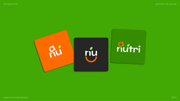
Fonts have sharp and solid edges. Despite all the fun, it's essential to bring discipline and focus when seeking a new healthier lifestyle. Even with this solid detail, playing with the letter A connected to the N letter balances the whole, accurately representing the balance between fun and discipline when eating healthier.
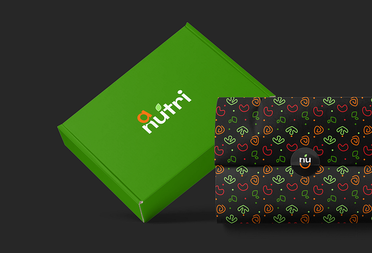
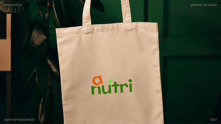
Products
Products bring the green and dark grey colors as a base for representing health and focus. Mixing graphic pieces resemble a salad of beans, carrot stems, herb leaves, and lettuce.
This pattern brought fun and lightness, connecting products and ingredients with the brand goal: make a healthy lifestyle fun.
Position
Educational, accessible, and close. A nutri's position has educating people as a focus in a joyful way. Professionalism, highlighting focus, commitment, and discipline to reach the desired goals.
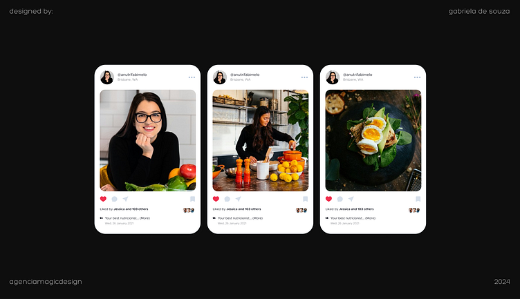
Photography
From nutritionists to delicious recipes, all pictures and videos are linked to a kitchen environment, high-quality ingredients, and professionalism of involved parties.
Focusing on ingredients, boiling, draining, slicing, lots of slow motion, and focus on meal details should reinforce quality and professionalism, creating the desire for whoever watches it.
Video transitions showing kitchen mistakes, relaxed comments about the weight-loss process, and interactions between kitchen professionals are very welcome. These actions show the humanity side of the brand, bringing its clients closer and making them feel part of it, inspired to follow the chefs' steps and get fond of all professionals.

Tone
Professional, intimate, fun, and comic. Phrases like:
• "I knew you would ask that"
• "I know what you're thinking"
• "It's not worth eating what's beyond the scale, right?"
These generate an instant connection and make the viewer have fun while learning. Being an online product, there must be phrases that create connection, and giving this flexible touch to the tone builds proximity.
Did you like it?
Don't hesitate to provide some feedback or just hit the like button. ❤️
