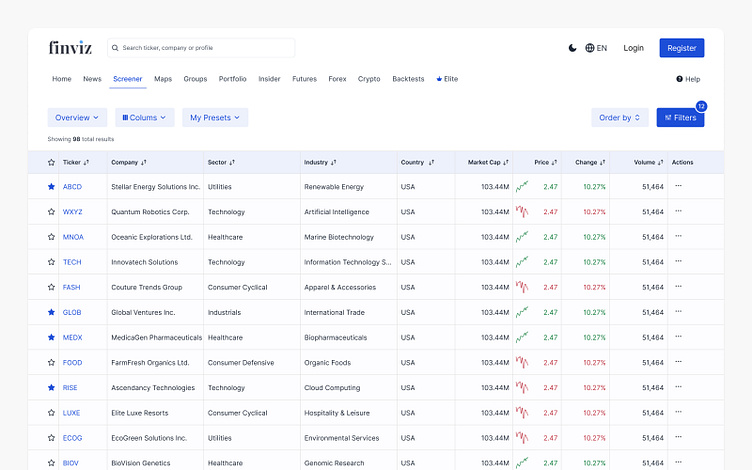
Financial screener redesign
Hello,
I'm excited to share the redesigned screens for a financial screener, a project I recently completed during the Complex UI workshop. This redesign aims to elevate the user experience by creating a more intuitive and informative platform for making investment decisions.
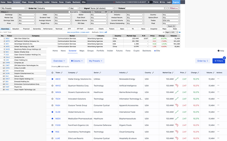
Before & After
Here you can see the platform before and after the redesign.
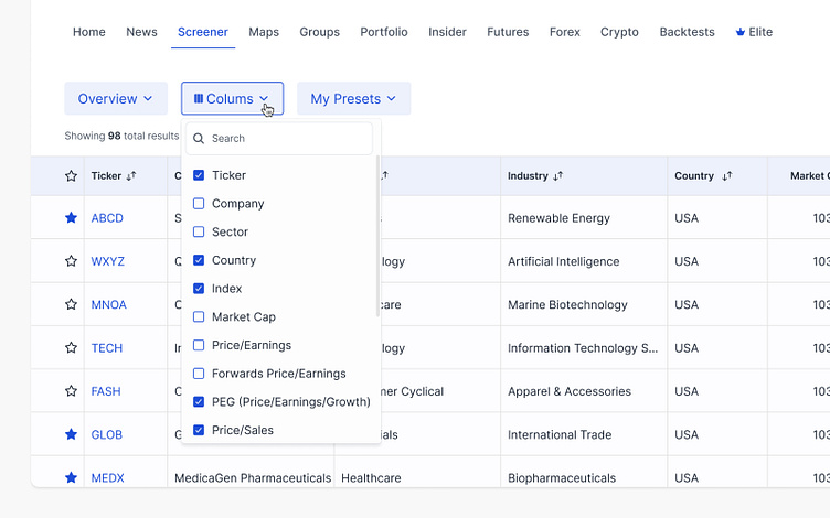
Empowering user control: redesigned column configuration
The previous column configuration in the financial screener felt overwhelming and difficult to manage.
This redesign addresses that by offering a separated organization with intuitive controls. Users can now easily access and customize columns, creating a more streamlined workflow for investment research.
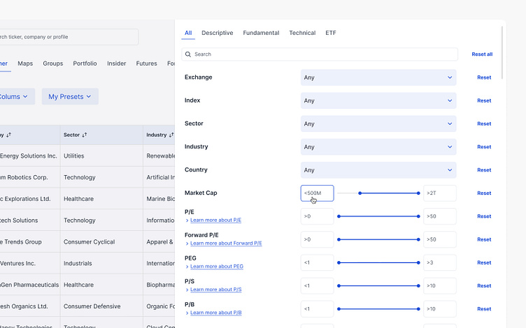
Simplifying filtering: intuitive access and clear options
Previously, the financial screener's filters were all constantly visible, but lacked clear organization or grouping. This made it difficult for users to find specific filters and understand how they interacted with each other.
This redesign solves that by introducing an intuitive filter access button. The filters panel unfolds with well-organized and clearly described filter options. This allows users to effortlessly refine their search based on specific criteria, leading to a more efficient and targeted financial research experience.
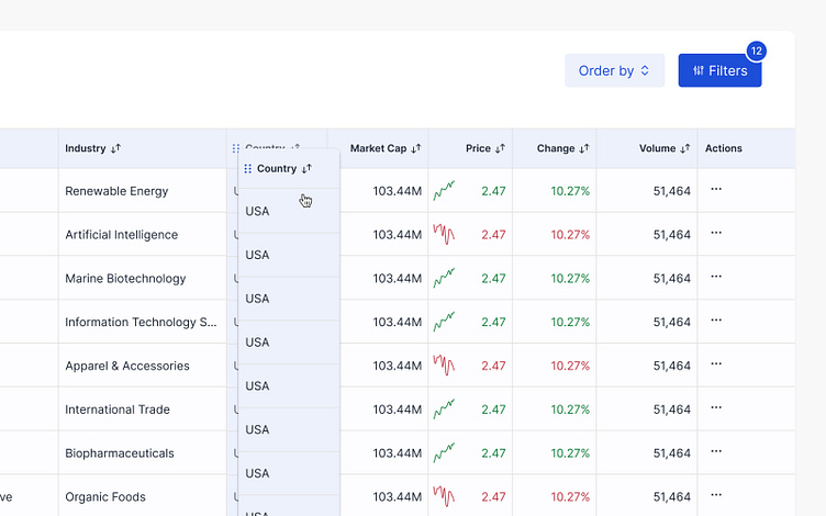
Improving data analysis: Drag & Drop customization
The original financial screener presented data in a static table layout, making it difficult for users to prioritize and analyze specific information.
This redesign introduces a drag & drop functionality. Users can now easily rearrange and reorder data columns, creating a personalized view that aligns with their investment research goals.
Get in touch with me
Reach out at reginaverbovskaa@gmail.com or let's connect on LinkedIn.
Let's create a user-centric digital experience based on your ideas!
