Feeling Good | Psychologist
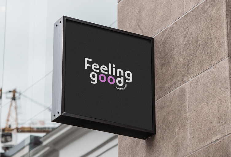
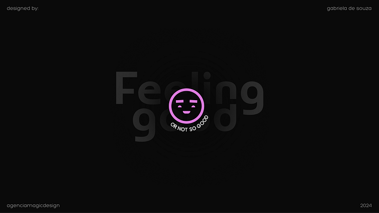
Feeling Good
A network of psychologists for children and teenagers.
Feeling Good's proposal is to bring psychology to life in a fun, light-hearted and sincere way, showing that it's okay to talk about emotions, to cry and to show fragility - after all, it's okay not to be okay from time to time.
Challenge
To make the niche relaxed and fun, preferably camouflaged.
The idea was not to look like a psychologist's office, but rather a studio or a place where you can meet a friend for a chat.
Feeling Good's proposal is to promote a familiar, cool and relaxed space. Have you ever wondered what it would be like to share your experiences while sipping a soda and eating good snacks? That's how the session at Feeling Good works.
Studies show that more and more young people and teenagers are seeking therapy to treat trauma and psychological problems. One of the main comments is how safe and comfortable they feel talking about their weaknesses when they are with a professional they can identify with.
Therefore, our mission was to make this closeness and connection even greater and better through visual resources, connecting the visual identity directly with the model of care proposed by Feeling Good.
Construction
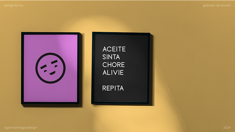
Emotions were the basis for our visual identity. These are the chosen ones:
- Joy
- Neutrality
- Anger
- Sadness
- Surprise
- Determination
- Boredom
- Affection
- Malice
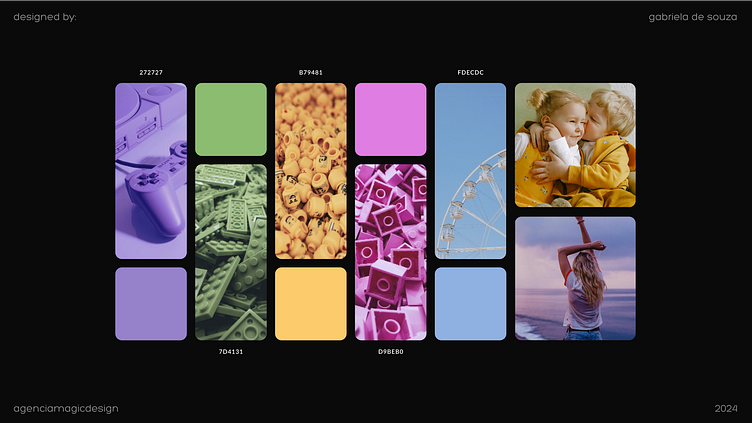
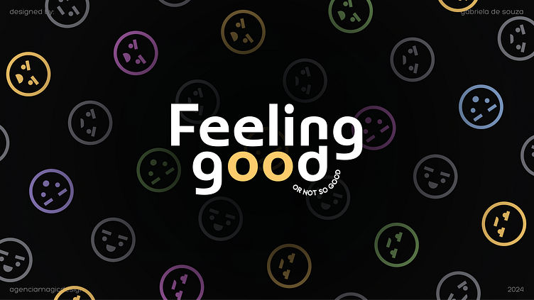
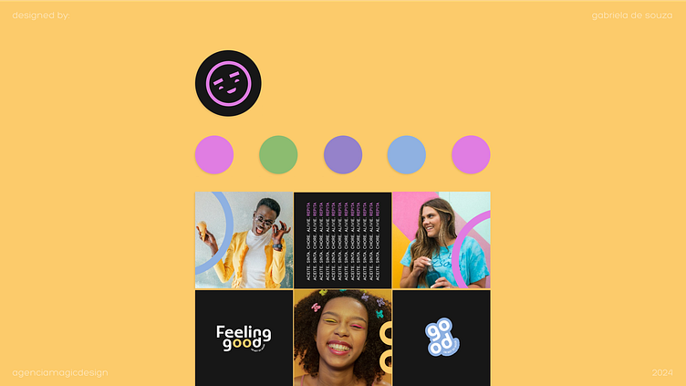
Colours
Colours bring about a balance between light and dark. In a playful way, we use darker colours to represent repressed emotions, while the nuances of the highlight colours represent different insights, ideas, freedom and joy, which are feelings commonly noted in the healing process through therapy and psychology.
Fonts
The rounded and strategically positioned fonts bring the idea of "playfulness", fun, flexibility and closeness, which is exactly how patients should feel when they come into contact with the brand.
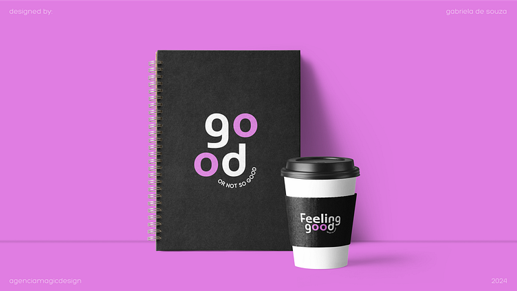
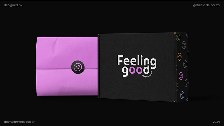
Products
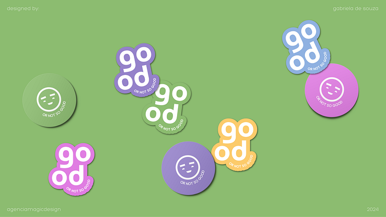
In the fun and functional line, we have the most colourful and fun products you've ever seen. The idea is to make every product usable by Feeling Good psychologists and patients.
Each patient receives an evolution box with essential materials to accompany them in the therapy process. Water cups, an agenda for notes and insights, personalised pens and stickers, all to make the process even lighter and more didactic, encouraging creativity and promoting closeness between patients and professionals.
Positioning
The brand's positioning is fun, inclusive, young and modern.
In its communication, the brand defends expression, freedom, individuality and being different. After all, the brand itself escapes the natural standards for the niche and so it makes perfect sense to instigate this search for "escaping the standards" through communication.
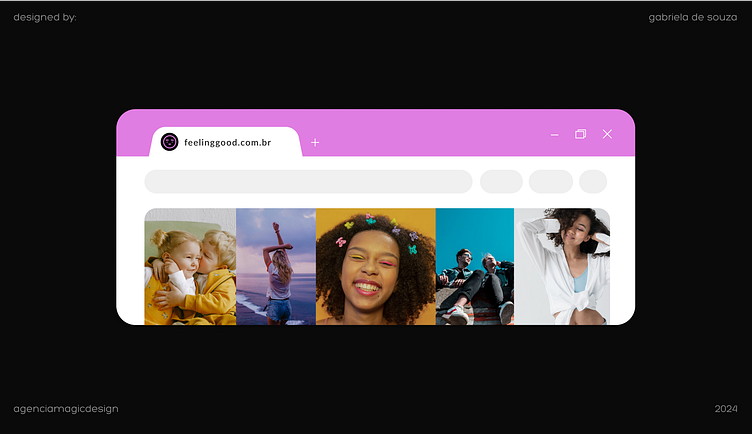
Photography
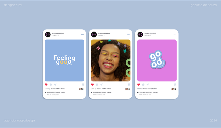
Stickers, cut-outs and colors are Feeling Good's trademark.
On social media, the posts always have fun and contrasting color combinations, the photos highlight different skin tones, different bodies, different hair types and cultures and encourage individuality and inclusion through images.
Photos with the products in the kit are always welcome and arouse curiosity, generating instant connection and interest. That's why it's important to always associate the photographic content with elements of the brand that make sense in the context.
Tone of voice
Friendly, fun, light and contagious. Feeling Good is always facing all the feelings coming up and it knows exactly what to do.
Laughing at problems, talking about them, opening up, and sharing learnings and moments in life convey the idea of intimacy and connection and open space for people to share their thoughts and processes, too.
Sincere and very loyal, Feeling Good is the friend you want to have for many years to come.
Did you like this project?
Don't forget to show your appreciation and encouragement.
