Tatiane | Nutritionist
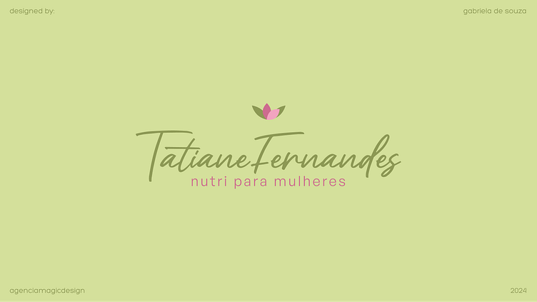
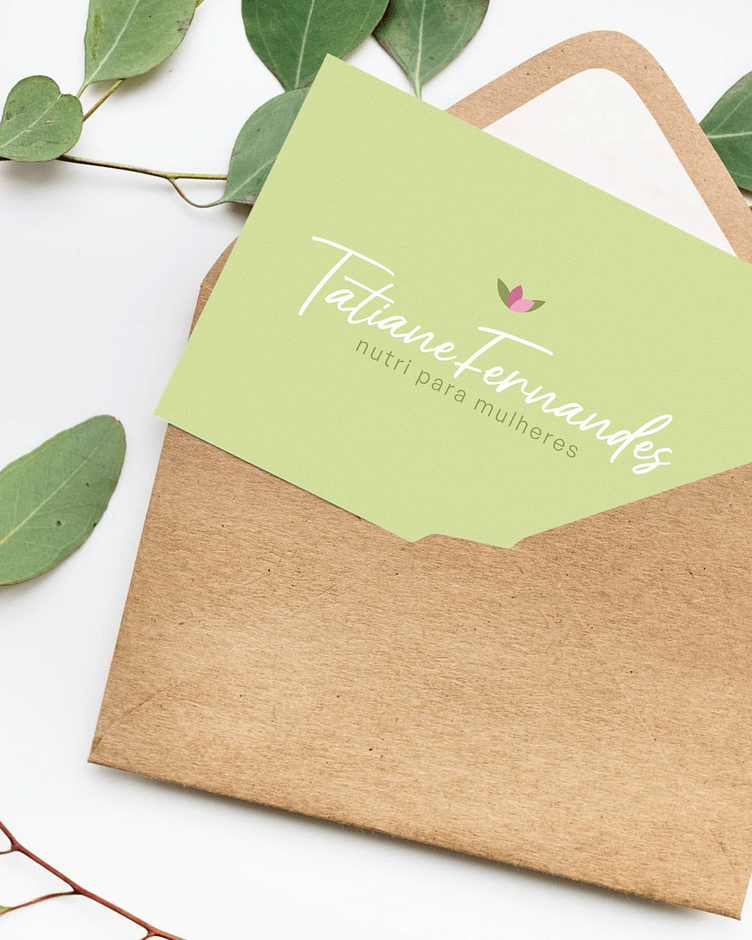
Tatiane Fernandes
A brand inspired by the journey of losing weight. It aims to make nutrition accessible so more women can find self-love and feel satisfied with their bodies.
The Challenge
Representing nutrition in a light and accessible way was a big challenge.
This market, for the most part, has a more gourmetised, expensive and exclusive feel and we wanted two of these characteristics: exclusive and gourmetised. It should look accessible.
The nutrition model proposed by Tatiane deals with a flexible diet.
Studies have shown that flexible eating makes a diet sustainable in the long term and brings effective results. In addition, flexible dieting reduces stress, improves self-esteem and helps develop healthy habits.
In other words, the woman who is accompanied by Tatiane tastes freedom, transformation and a change of habits, which is why these were key sentiments in the creation process.
Construction
To develop the basis of the logo, use these sources of inspiration:
• Cycle phases
• Beauty from the inside out
• Nutrient for mind and body
• A delicacy without process
That's why I thought of flowers as the main symbol.
Flowers need to be nourished in the soil, so they're able to grow and go through all their phases until they bloom. It is delicate and needs to be cared for and carefully observed, but when it finishes its cycle, it is beautiful, with soil full of nutrients and strong roots to support the coming seasons.
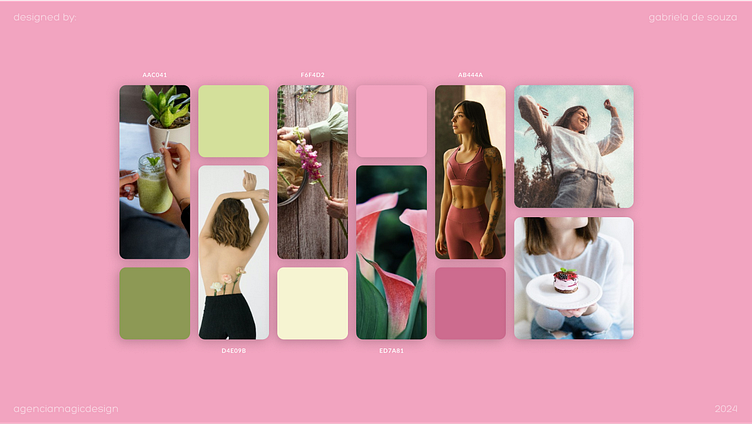
Colors
They bring the impact and professionalism that the brand needs through more closed pink and green, while still being delicate and accessible with the use of light and neutral tones, more open.
The mix of pink tones further reinforces the message of accessibility and femininity, in a clear and assertive way for Tatiane's audience, which involves young women, who want to have nutrition in an accessible, light and pleasurable way.
The romance that pink brings also reinforces the self-love and care that clients come to value and practice when they decide to start nutritional monitoring.
Fonts
Curvy and delicate, they reinforce femininity and delicacy.
They enhance the curvature of the body and reinforce the idea of phases, cycles and transformation.
The mix between the curves of the handwritten font and the slightly rounded edges of the block letter communicates the brand's identity in a balanced way, giving continuity to the visual set and its meaning.

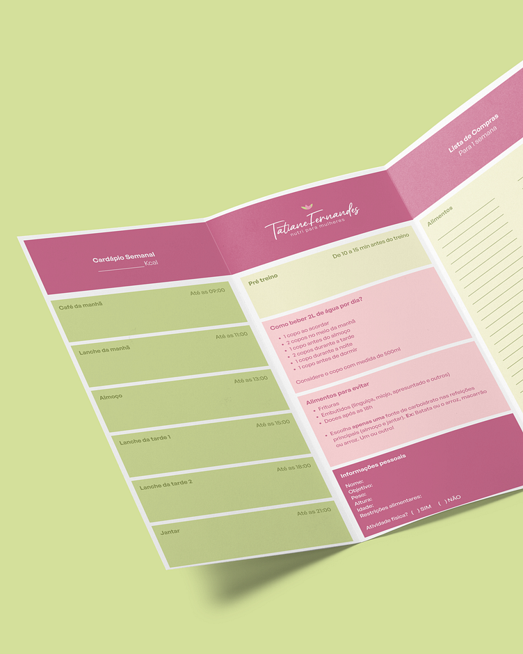
Products
For Tatiane, I developed a personalized food planner for clients that can be printed or filled out digitally.
The planner has complete guidance for a weekly diet, hydration, restriction list, shopping list and patient and nurse information.
In addition to having a space for all daily meals and their respective times, I included a space for the total number of calories in the diet, which made the planner functional and practical for clients' daily lives.
Positioning
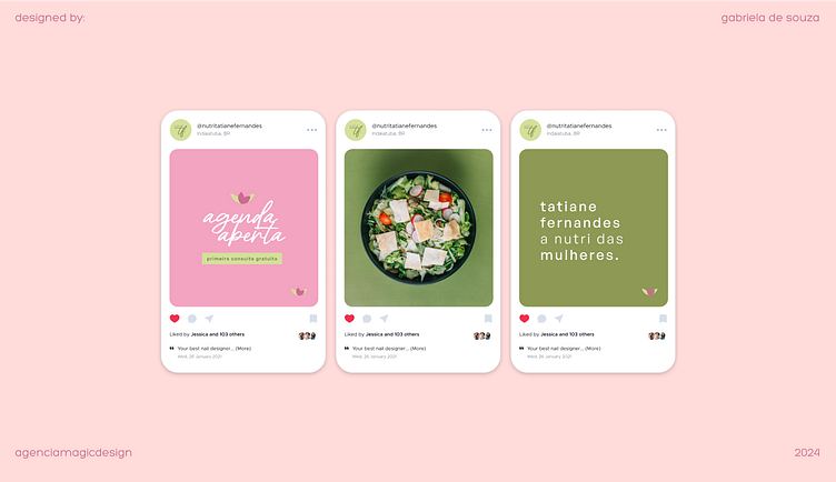
On social media, the nutritionist's positioning is close, friendly and empathetic, always bringing understanding and acceptance. Each person has a different lifestyle, so empathy is crucial when going through the daily process for better and healthier choices.
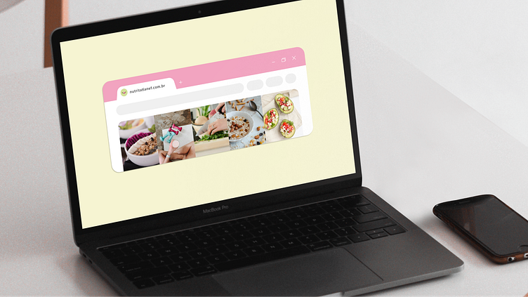
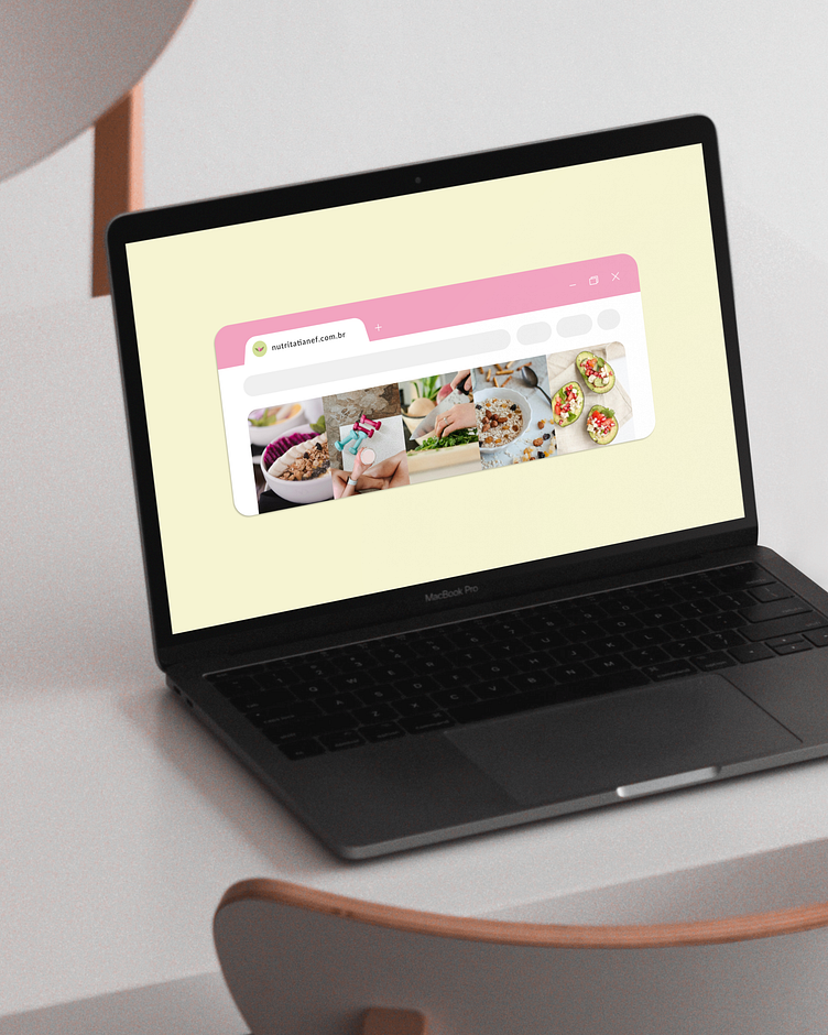
Photography
Lots of photos of the office, meals and the nutritionist herself. Tatiane's profile is professional but has an exaggerated personal dose as the idea is to make the professional her clients' best friend.
Beautiful, well-lit dishes, easy and practical recipes, information about ingredients and nutritional values, photos of the nutritionist following the eating plan and everything that motivates, inspires and teaches the audience how to achieve better results.
Voice tone
Accessible and intimate. Nurture is a friend to her clients, she listens, she welcomes and she brings solutions. Once you're part of the team, you'll never want to leave it, so the brand's tone of voice and general communication must always have inclusive and welcoming phrases.
Tatiane uses lines like:
• honey
• you are not alone
• if you need help, you can call me
• if you want something, let me know
This was a source of inspiration for creating the brand's profile and general communication.
More than nurturing, she welcomes and understands you at every stage of the process.
Did you like this project?
Be sure to show your appreciation and encouragement.
