UX/UI Design for CDS Healthcare Platform | Masterly
Outcomes
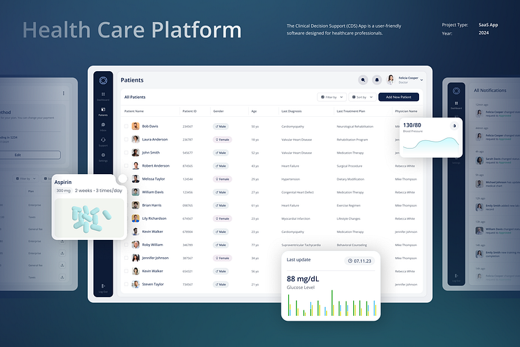
The CDS Healthcare Platform redesign led to an enhanced user experience marked by a 40% reduction in workflow interruptions and a significant increase in user satisfaction ratings. Our efforts streamlined complex processes, allowing healthcare professionals to access vital information swiftly and efficiently, directly impacting the quality of patient care.
Problem
Initially, the platform was plagued by a cluttered interface and convoluted navigation paths that hindered quick decision-making—critical in high-stakes healthcare environments. Users faced challenges in locating essential tools and functionalities, leading to delays and increased cognitive load.
Solution
Our team tackled these issues head-on by implementing a minimalist design that focused on clarity and ease of use. We restructured the information architecture to prioritize core actions and redesigned the user interface with a focus on reducing visual clutter. Regular feedback loops with end-users ensured our solutions were not only theoretically sound but also practically effective in real-world medical settings.
Design Process
Discovery Phase:
Research: Conducting comprehensive market and user research to align the platform with real-world needs.
User Experience: Strategizing a user journey that promotes clarity and efficiency.
Brand Identity: Developing a resonant brand personality that communicates trust and innovation.
Design Phase:
Design System: Establishing a cohesive design framework for consistent user experiences.
User Interface: Engineering an intuitive and accessible UI for streamlined user interactions.
Delivery Phase:
Prototyping: Crafting detailed prototypes to visualize the end product and facilitate iterative testing.
Validation Phase:
Testing and Refinement: The final design was rigorously tested in two clinical settings, resulting in immediate validation as both clinics adopted the platform, purchasing annual subscriptions. This phase ensured that the platform not only met the high standards of healthcare professionals but was also robust and reliable for long-term use.
Customer Journey Map: Nurturing Intuitive Design
The Customer Journey Map is a cornerstone for all user flow and navigation development. It was pivotal in shaping the main user journey from start to end.
Ideation matters: An app without a Dashboard?
One of the client's primary requests was the creation of a dashboard.
Our initial approach was a dynamic brainstorming session, where various concepts took shape, leading to the drafting of several wireframes adorned with charts and bold numerics.
However, as we progressed and prioritized user tasks and objectives, we came to a pivotal realization: a dashboard, while typically central to data interaction, was not essential for this project.
Instead, our insights directed us toward a more functional and streamlined solution—a table with requests—serving as the gateway to the user's journey, aligning perfectly with the daily workflow of a doctor.


