Coaching Process 2
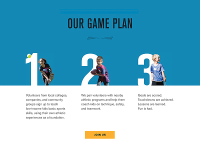
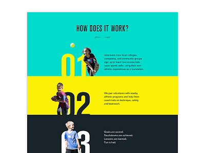
Trying a horizontal layout so the steps seem more closely related; like a complete process with an obvious CTA. Also, you're more likely to see all steps at once if you're on a medium or large device.
Which do you prefer?
Click the link to see the full size version. Designed at Vermilion.
More by Lacey Ankenman View profile
Like


