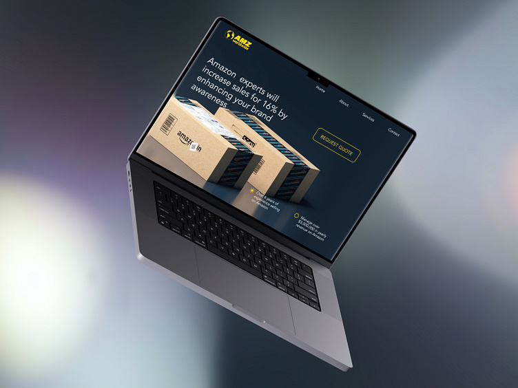
Hero Section for the Website for Amazon Services
📜 The good receipt for the delicious design starts with a strong idea for the core concept. To enhance the dish's taste, you can use spices like typography and colour. The visual hierarchy regulates the proportions and layout of each ingredient transforming the mix of products into a dish 👌🏻 Yummy-yummy 🤤
🅰️ The client was the company providing services for Amazon sellers. Their website was designed a couple of years ago and has issues with the design and outdated information. During the preparation for the first recruitment interview, I decided to cook something with the hero section of the company’s website 👨🏼🍳
🥑 The core concept for the receipt was the image illustrating the type of services/products and the major platform the company works with (Amazon). To the hero image, I added a call to action, an accent button and the company’s achievements with a simple and clear layout. The fonts and colours I didn’t change as they are calm, clear and concise. I wanted this dish to have an exquisite taste, not too spicy, not too sweet ☯️
🥐 After the dinner (interview) the client had a good appetite and enjoyed much with my design meal. As a result, I was invited to the next step of the interviewing process.
🍳 If you want to cook with me something delicious and healthy for the growth of your business or the client’s conversion, just let me know. I have so many receipts for you! 👨🏼🍳


