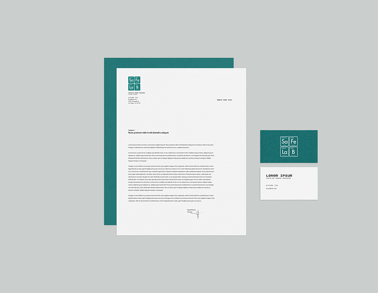
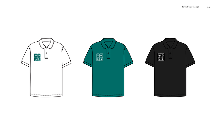
SaFeLaB and SaFePaL Awards Logo & Branding
Logo animation for San Diego State University's EHS department's Laboratory Safety Awards "SaFeLaB" and "SaFePaL"
Design Brief: Environmental Health and Safety (EHS) Department at SDSU is rolling out a few initiatives to improve the safety culture in labs on campus.
• One of these initiatives is designating an individual who goes above and beyond a "safety champion"--and give them a badge or certificate with the logo on it.
• Another initiative is awarding the lab that completes all the necessary setup in the online system, a similar badge/certificate that they can display.
Design Process
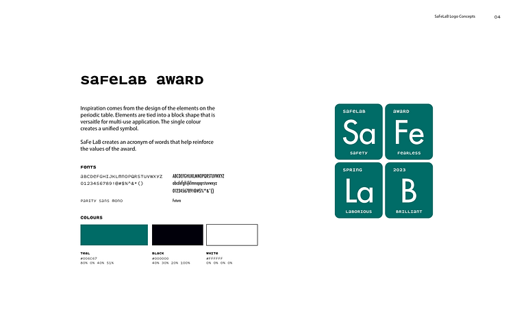
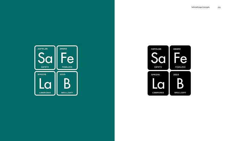
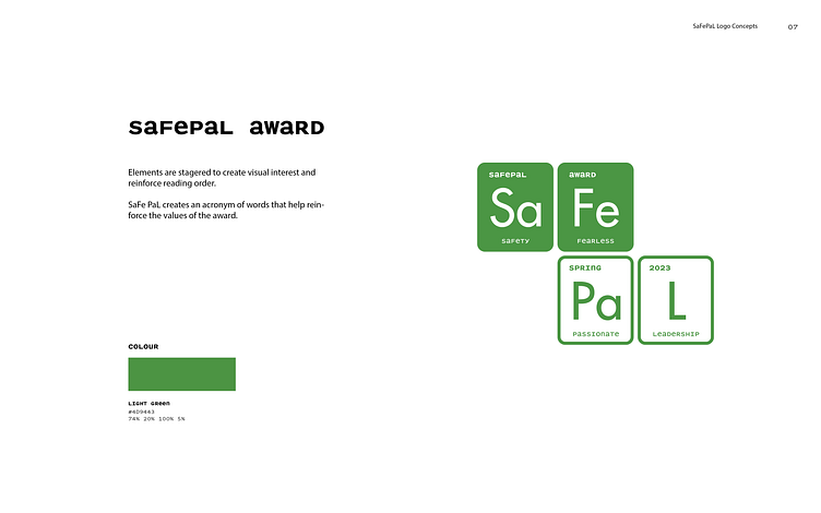
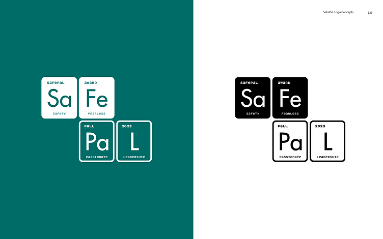
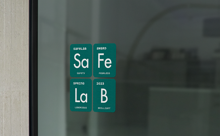
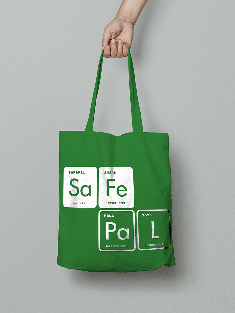
When we were thinking of how to incorporate the sciences and labs we thought of the Periodic Table as the elements are present in nature which is usually one’s thought when thinking about science. We were also thinking about how we could arrange the periodic table concept into a badge, and so the idea came from Scrabble. The arrangement of letters into a block also serves as an acronym. This way the logo is contained, and fun to work in a variety of applications.
The fonts chosen for the project were Futura and Parity sans mono.
Futura was chosen as a nod to vintage periodic table designs and for it's clean and sharp forms that are clear to read and evoke intelligence & diligence. Parity sans was chosen to bring a fun and tech element to the logo's secondary typography. Parity sans' construction allows for secondary material to continue carrying out the uppercase and lowercase pattern of the elements of the periodic table.