Redesign for an electricians' website
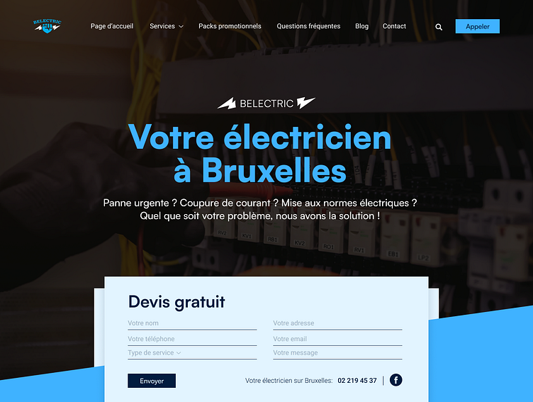
For some reason, they have two logos with different colors. Step 1: I decided to skip the one with green and continue with the branding of the blue logo, which is more appropriate for their brand.
I discovered that both the 'Contactez-nous' (contact us) button and the contact label in the navbar direct you to the same page (contact page). Step 2: Therefore, I removed the 'Contactez-nous' (contact us) button and instead created a 'Get a Quote' form which is more effective
Step 3: In the form, I also included the phone number and their Facebook icon.
Step 4: I moved the 'Appeler' (Call) button to the right where the 'Devis Gratuit' (get a free quote) button was. Without the top bar, there's more space and it looks less cluttered.
Step 5: 'Belectric' is their name and they used it in their heading. Personally, I didn't like the idea, so I used elements of their logo instead, made it smaller, and changed the color. Let me know what you think about my redesign!


