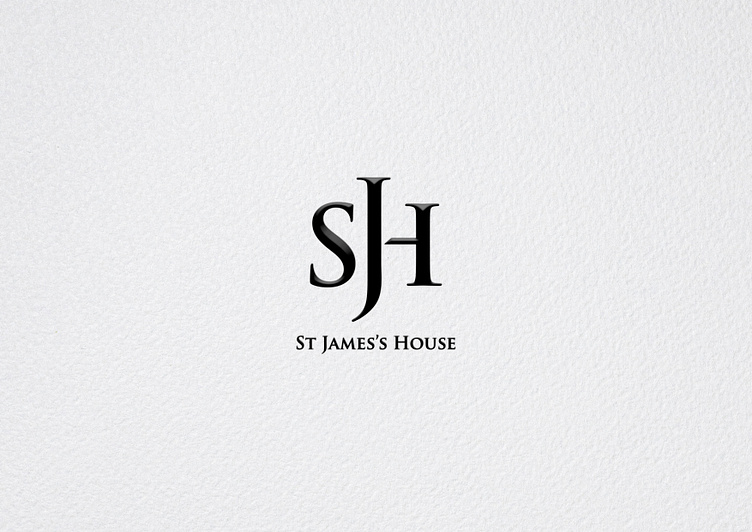
St James's House branding
SJH Monogram
St James's House is a leading publishing, communications and events company that supports a range of public, private and third-sector organisations creating unique luxury coffee-table books.
CHALLENGE
While working at the SJH Group, the company’s monogram used for printed publications, digital, marketing and events needed to be re-designed with a fresh approach. One of the key aspects was to retain a level of familiarity, not to create an all new identity. The concept must rather refine and improve the existing logo with a more functional approach.
GOALS
Create new, more functional monogram, which works across different types of print and scale applications, and digital.
Keep original branding, but only develop monogram.
STRATEGY & CONCEPT
To achieve the soft monogram refresh, I utilised the original brand and logo font Trajan Pro Semibold as its use would continue throughout brand assets and still be used on the heritage logo. Additionally, it was important to strike the right balance between elegant, bold and functional.
As a first step, I stripped back most main components of the heritage logo, and focussed solely on the sound of the words. This concept developed from the ideas that as a publisher we always worked with words, playing with headlines and book titles spoken out loudly.
“James’s” being the most prominent word of the brand name took centre stage, being a little larger – this created visual curve similar to the tonal curve of the full and shortened name: St James’s House / SJH. Lastly I created more negative space similar to ink traps used in typography and font design.
The logo mark is used across many projects, most notably on the Royal British Legion cook book “Cooking For Heroes”, The Queen's Official Platinum Jubilee Pageant album, “A Vote For Women” publication as well as several marketing campaigns and events.
Full case study: https://www.jochenviegener.com/projects/sjh-monogram


