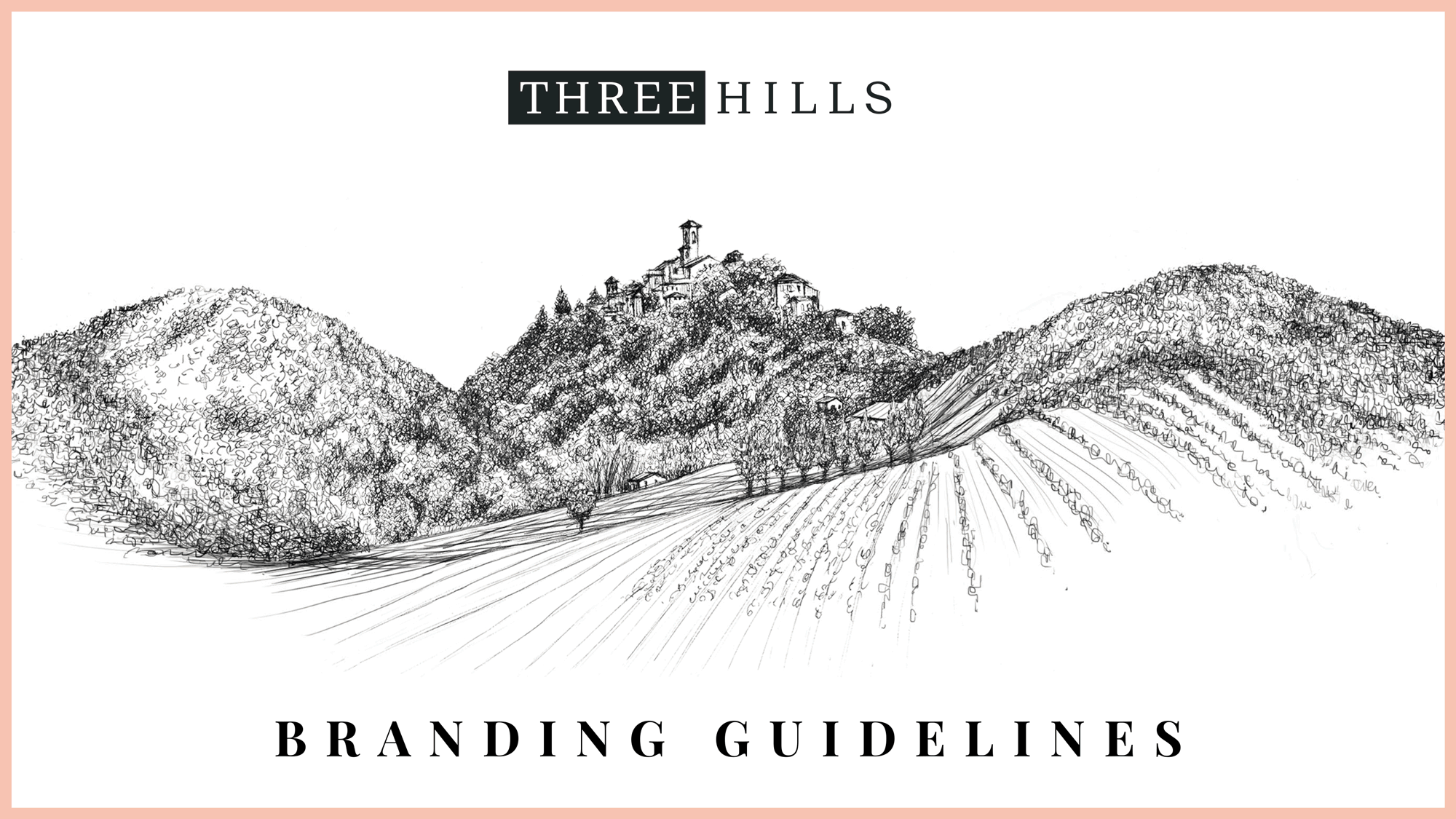
Three Hills rebrand
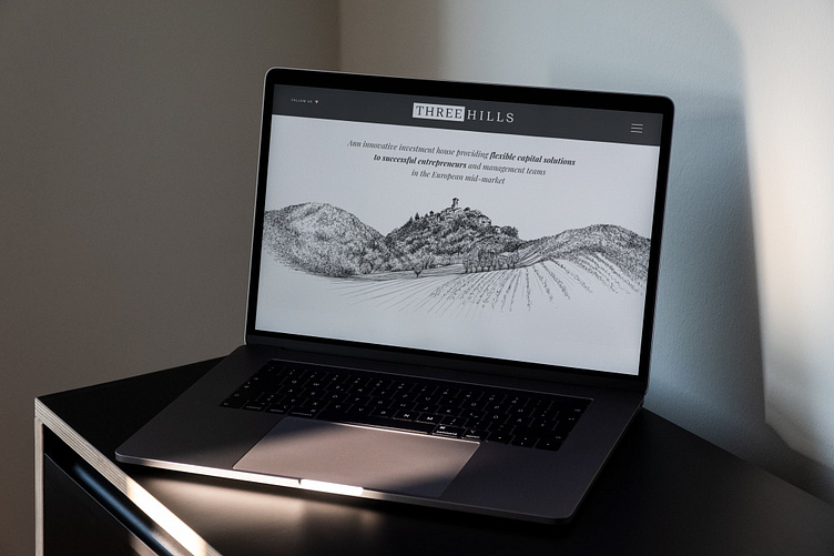
Three Hills is an innovative investment house providing flexible capital solutions to successful entrepreneurs and management teams in the European mid-market.
CHALLENGE
After nearly 10 years, Three Hills decided to streamline different group brands under a new umbrella, leaving core brand attributes in place but wanting to lean more into a heritage ethos by refining messaging, marketing and branding. The challenge was to find the right level of brand refresh needed and to reinforce the brand as go-to strategy for its investors.
GOALS
Clearer and aligned brand messaging.
Develop refreshed brand that feels consistent but artisanal.
Update brand tools and touch points in accessible, user-friendly way.

STRATEGY & CONCEPT
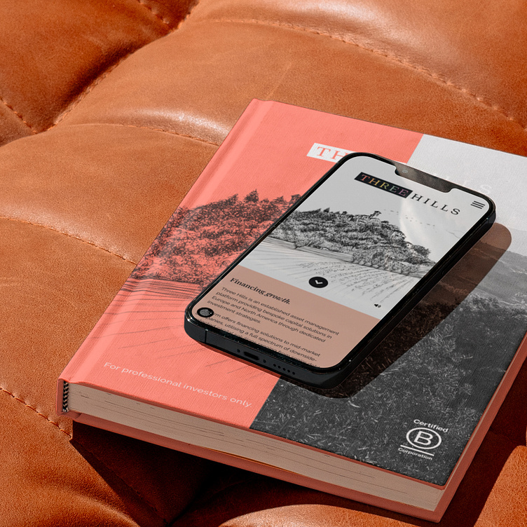
With a tight knit in-house team, we quickly developed company specific brand workshops, exploring creative directions to expand on the foundations of the existing identity. Through workshops with key stakeholders, it became quickly apparent that Three Hills needed modernising its visual identity but without loosing touch to its artisanal roots in the three hills of Collazzone, Italy.
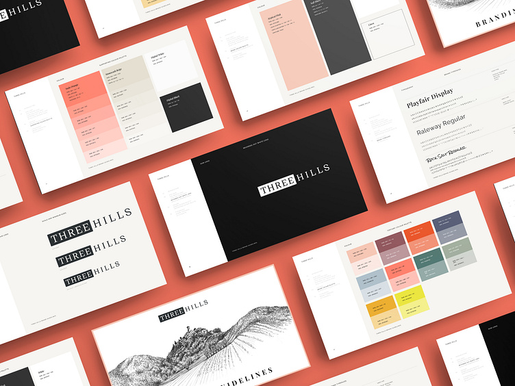
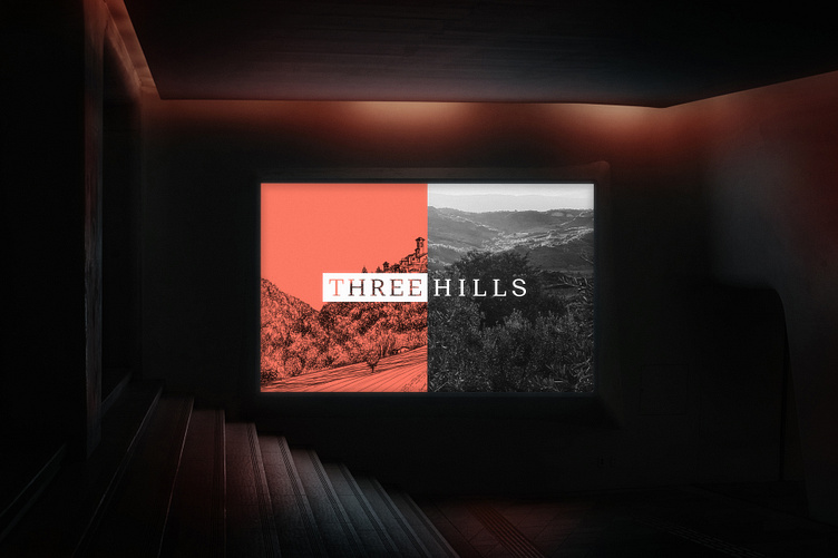
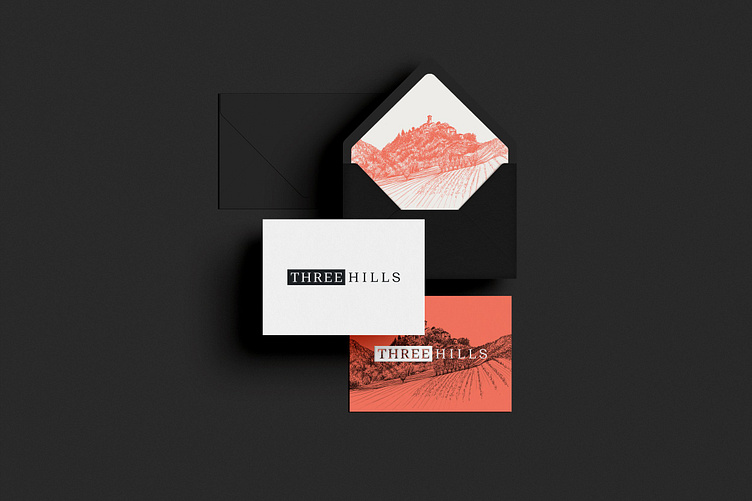
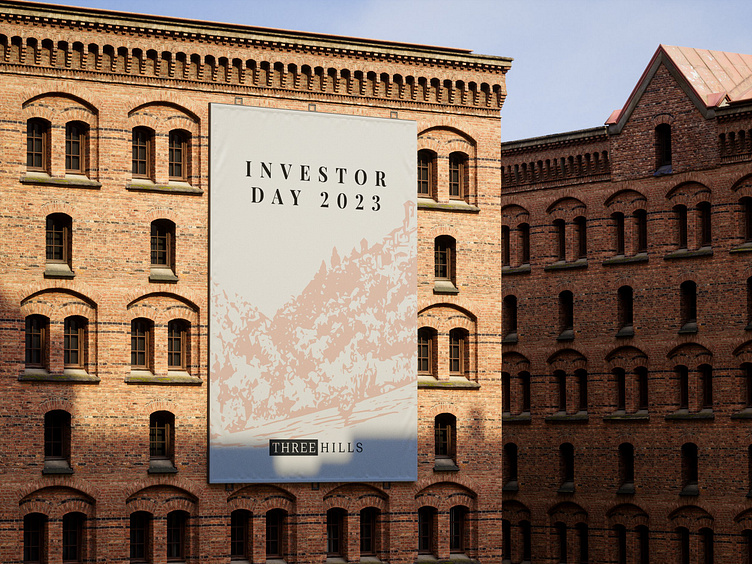
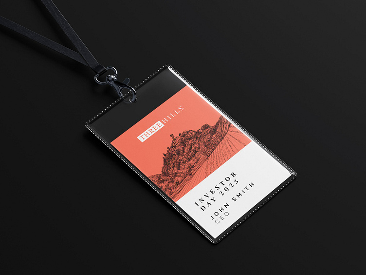
The core concept is keeping the illustrative approach with hand-drawn line art hero assets for the brand, portfolio and staff portraits but combining it with more modern approach to typography.
The new typographic system uses a combination between Serif for headlines, sans serif for body copy and page furniture, and script for personal touches.
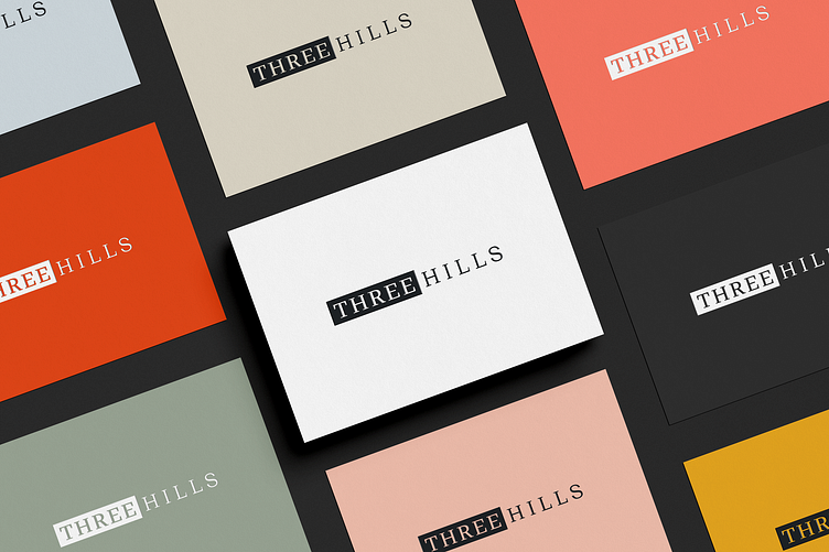
The new expanded colour palette is inspired by the building colours of Collazzone, creating a direct link between heritage and modern application.
New brand assets include a new logo, expanded colour palette, new brand fonts, a slightly refined art direction and new verbal strategy for communicating in- and outside the company.
Full case study: https://www.jochenviegener.com/projects/three-hills
Credit: Verbal Branding – Lisa Leid; Principal (Three Hills) – Laura Heely.