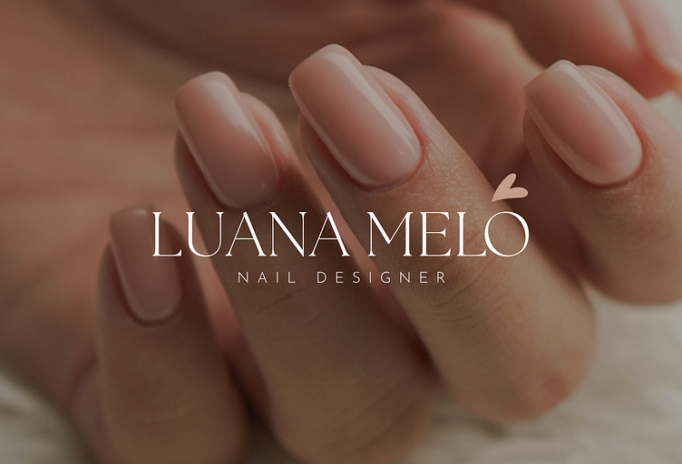
Luana Melo | Nail Designer
Luana Melo
It is a brand that delivers perfection, quality and delicacy through its service. Nail Designer Luana believes that nails can raise a woman's self-esteem and that technique is the key to delivering exceptional results for her clients.
Challenges
Bring delicacy and sweetness without representing childishness in colors and visual resources. Many of the nail elements are associated with sparkles, hearts, flowers, and if incorrectly used, they can refer to a children's brand.
The idea here is to bring professionalism, exalt textures, shapes, and especially the beauty of nails and women.
Furthermore, I want to bring strength and empowerment through visuals.
According to research, 57% of women feel more confident when their nails are done, 80% associate beautiful nails with a more youthful and well-groomed appearance and 65% say that having their nails done makes them feel more confident and prepared for personal challenges. and professionals.
In other words, empowerment and femininity are part of the visual and brand graphic representation.
Construction
As a base for this logo, I used:
• The shape of a styled heart
Highlighting love and care in every detail of the process;
• Hands
Representing clients and the delicacy of the work;
• The tip of a brush
Main tool for styling gel nails;
• L from Luana
To represent the professional in the details of the brand.
Colors
The colors were chosen with sophistication, naturality and elegance in mind, which is why we have a variety of neutral colors. These tones fit skin tones, connecting directly with the colors of the gel used as a base to shape the nails.
Darker colors highlight the strength, professionalism and glamor, that are wanted to represent the brand, without compromising the delicacy of the other tones.
Fonts
The fonts were also chosen with elegance and sophistication in mind, so we opted for thin, serif fonts for highlighted texts, and a simple, uppercase font for subtitles.
For long texts and buttons, the font was used in natural form and can be used in both regular and bold modes, and in other available variations.
This combination promotes elegance, femininity and sophistication, essential feelings for the brand.
Products
Products must follow the gourmet and minimalist line. The combination of the pink tone with the dark gray brings the sophistication and delicacy that the brand stands for. In each package we have considerable breathers, giving space for the colors to play while the fonts complement the overall style of the packaging.
Simple, easy to use and sophisticated are the characteristics that define the products.
Positioning
On social media, the positioning must be intimate and confident, always highlighting the techniques used, the details and benefits of each technique, in addition to encouraging self-care and self-love through the action of doing your nails. Reminding customers that they are important, that they should take care of themselves and take time for themselves is the brand's main goal.
Photography
Photos close to the nails, well lit, showing curvature, cuticles and details, always with high quality. The nail is the main service and therefore must be shown 100% of the time. Videos showing the process, up close, are also welcome and valued. How are your clients treated, what do they receive, how do they feel? Making this clear through photos is the secret to growth on social media.
Voice tone
Intimate, delicate and confident, Luana has no doubts, she is sure that she has the best technique and that her processes are capable of rescuing the strength, confidence and femininity of her clients. Therefore, she always speaks clearly and with certainty. Focusing on desires, pain and results, the brand always brings the solution you need, when you need it.
Did you like this project?
Be sure to show your appreciation and encouragement.


