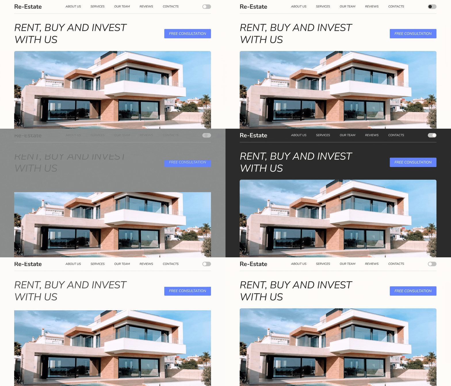
Dark mode. Landing Page for Real Estate Agency
To create a dark mode I’ve been thinking how to make it not ordinary and with some feature. So, I made a simple but an interesting transition between light and dark mode. For switching between these modes I used switch button. It’s in a grey color to not take too much attention from the main “Call to action button”.
While hovering on this button in light mode the circle becomes dark - it signals to user that he can switch on dark mode.
While hovering on this button in dark mode the circle becomes light and the user understands that he can turn on the light mode.
Let me know what you think!
Available for collaboration - nataliedonenko@gmail.com | Behance | telegram: missnatali7
More by Nataliia View profile
Like
