detention design, creative agency
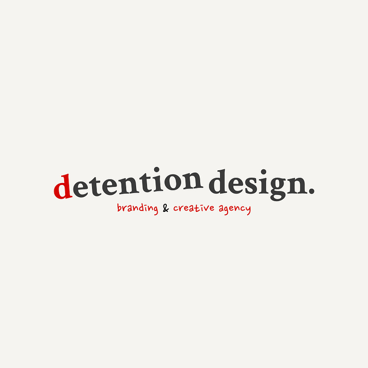
This is a fictional creative agency for all of the creatives that doodled during class while growing up. The idea plays on the fact that this could have been perceived as something a delinquent would do, hence "detention design."
The primary logo is tilted because, well let's face it, we couldn't sit still. And the secondary logo is a scribble because doodles...The color red is inspired by the classic red pen used for grading, light cream suggests aging, and the gray with white was inspired by chalkboards.
Brand elements include little doodle icons that can double as a pattern. There's also a "I will not stop doodling" pattern, which is a nod to the punishment of writing what you did on the chalkboard (think Bart Simpson.) a third option is that classic notebook pattern. Finally, the business cards are inspired by detention slips :)


