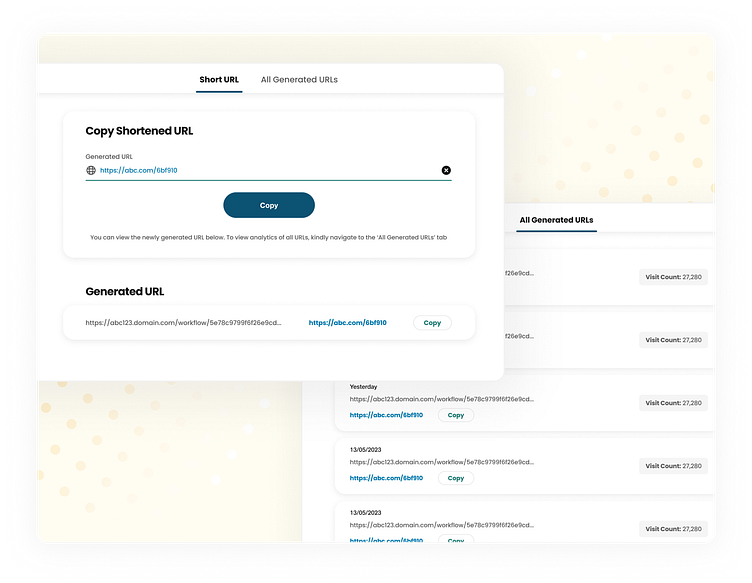
URL Shortener Web-App
I conceptualised this URL shortener web-app for businesses and users, leveraging Human-Centered Design (HCD) principles and a lean design thinking approach. It offers a seamless and efficient way to shorten URLs while retaining valuable data for analysis and engagement.
Understanding the Problem :-
In today's digital world, lengthy URLs can be cumbersome to share, track, and remember. Existing URL shorteners often lack user-friendliness and transparency. Through user research, I identified key pain points mentioned below.
Difficulty in recalling shortened URLs.
Lack of information about link clicks and usage data.
Cumbersome copying of shortened links.
Inefficient experience for both B2B and B2C users.
HCD & Lean Design Thinking in Action :-
1. Empathize: I conducted in-depth interviews and surveys with users from diverse backgrounds, including marketing professionals, social media managers, and everyday internet users. By understanding their needs and frustrations, I established a clear vision for the product.
2. Define: Based on user research, I defined the core functionalities of the application:-
Effortless URL shortening: Users can simply paste their desired URL into a designated field and watch it transform into a concise, shortened link.
Data visualization: Each shortened link displays its visit count, date/time of creation, and the original URL for easy reference.
Clear call to action (CTA): A prominent and user-friendly button allows users to instantly copy the shortened link to their clipboard.
B2B and B2C compatibility: The web-app offers a clean and intuitive interface suitable for both professional and personal use cases.
3. Ideate: I brainstormed various design solutions, focusing on user needs and a clean aesthetic. I collaborated with cross-functional teams prioritizing simplicity and efficiency in the user journey.
4. Prototype & Test: Low-fidelity prototypes were created and tested with real users. This iterative process allowed me to refine the interface based on user feedback. I ensured the layout was intuitive and the CTA button was easily identifiable.
5. Validate & Iterate: I analyzed user feedback and usage data to further refine the web-app. Based on insights, I suggested features such as:-
Optional custom link naming: Users can personalize their shortened links for better branding or memorability (B2B focus).
Export data functionality: Businesses can download data on shortened link usage for campaign tracking purposes (B2B focus).
Benefits for Businesses and Individuals :-
Enhanced brand image: Share professional-looking shortened URLs across platforms.
Improved click-through rates: Shorter URLs are more aesthetically pleasing and easier to share, potentially boosting engagement.
Data-driven insights: Track link usage and gain valuable insights into user behavior (B2B focus).
Increased efficiency: Save time and effort with a streamlined URL shortening process.
Universal appeal: Caters to both B2B and B2C needs with its user-friendly interface.
--------------------------------------------------------------------
Do check out my other work & let me know how y'all found this one ! 😄✌❤
