UX/UI Website Design for Healthcare SaaS Platform | Masterly
Overview
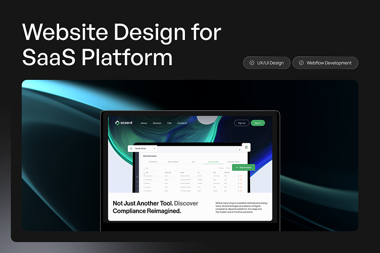
Navigating the intricacies of OSHA and HIPAA compliance is a vital, yet complex task for medical and dental practices.
Our mission with Ocoord was clear: streamline the compliance journey with a user-centric SaaS platform that speaks clarity and simplicity.
Live link:
The Outcome:
A harmonious blend of form and function, the Ocoord platform stands as a testament to the power of thoughtful design in demystifying compliance. We've not just designed a platform; we've delivered peace of mind.
Our Role:
UX/UI Design for SaaS: We crafted a user experience that guides users with precision, integrating complex compliance tasks into a friendly and approachable interface.
Responsive Website Design: The platform's digital front door had to be inviting and informative, prompting trust and action from the get-go.
Webflow No-Code Development: Utilizing the agility of Webflow, we rapidly developed, iterated, and deployed a fully responsive site with the flexibility to grow alongside Ocoord's evolving needs.
Emailers Design: Our email designs ensure clarity and engagement, providing consistent communication that resonates with the platform's ease of use.
AI-Generated Illustrations: We introduced custom, AI-generated illustrations to add a personal touch, enhance visual storytelling, and illustrate the ease of managing compliance through Ocoord.
Pitch Deck Creation: We synthesized Ocoord’s vision into a compelling pitch deck, encapsulating the core values and strategic direction, ensuring stakeholders grasp the full potential of this innovative platform.
The Wireframe Stage
Where Function Meets Form in the Blueprint of Compliance Navigation
Hero section
In the hero section, we embraced the classic yet effective approach of left-aligned copy, ensuring immediate engagement with visitors as they begin their journey. By showcasing crisp visuals of Ocoord's software on the right, we offer a window into the platform's functionality, inviting users to envision their experience.
Building Trust with Numbers
Impactful Statistics that Showcase Success
Feature Highlights: The Heart of Simplicity
Showcasing the Core Tools that Empower Practices
Structured Clarity: Containerized Layouts
Throughout the Ocoord website, we have embraced a containerized approach to design. This method involves using visually distinct sections that encapsulate individual pieces of content or features.
Prioritizing Accessibility for On-the-Go Professionals
Our design philosophy for Ocoord placed mobile interaction at the core. We adopted a mobile-first approach, ensuring that the most essential elements are not just responsive, but optimized for mobile use from the start.
Leveraging the Power of No-Code for Rapid Deployment
The development of the Ocoord website was executed within the innovative framework of Webflow, a no-code platform that empowers designers to build professional, custom websites.
Visual Development: Webflow’s visual development interface allowed us to bring design concepts to life with pixel-perfect accuracy.
Dynamic CMS: The integration of a CMS within Webflow streamlined content management, making it easy to update and maintain.
Responsive by Nature: The platform’s responsive tools ensured that our mobile-first designs adapted flawlessly across all devices.
Speed to Market: Webflow’s no-code environment accelerated our development process, enabling rapid prototyping and swift iterations.
Extending the Experience Beyond the Browser
Emails are a direct line to our users, and for Ocoord, we crafted system emailers that resonate with the platform’s ethos of clarity and efficiency.
Persuasive Storytelling Meets Visual Impact
Our commitment to conveying the Ocoord story extended into the realm of investor relations with the design of a compelling pitch deck.


