Creatd - Behance Case Study
Hey everybody!
We are excited to share some more of Creatd's new Visual Identity.
Check the full case study on Behance:
https://www.behance.net/gallery/195904309/Creatd-Visual-Identity-Website
Creatd's Visual Identity
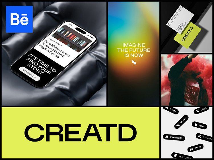
We developed a custom wordmark that strikes a balance between subtlety and impact, reflecting the versatility of Creatd's services and its forward-thinking, innovative ethos.
Regarding typography, we carefully selected Favorit Pro, a refined grotesque font, complemented by its underlined version, Favorit Lining, for specific elements, and employed its subfamily, Favorit Extended, for titles and headlines. This choice enables the brand to showcase its adaptability and visual impact in nuanced ways.
In addition, we curated a diverse collection of modern symbols representing the full spectrum of services and possibilities offered by the company. These symbols can be strategically used in either subtle or bold manners, depending on the context.
__
A huge shoutout to everyone involved in the project. This achievement wouldn’t have been possible without the detailed guidance from our Branding team, the expertise of UX, the discerning eye of UI, and the nitty-gritty of our Development team. Hats off to our motion design team for bringing it all to life.
Original design created by Sasha Denisova
We are BB Agency
We are a partner for digital evolution, merging creativity and technology for holistic growth.
We join forces with companies dedicated to addressing real human needs. Leveraging our full-cycle digital capabilities, we shape brands, experiences, and products that enrich the lives of millions every single day.
Check us out at www.bb.agency
