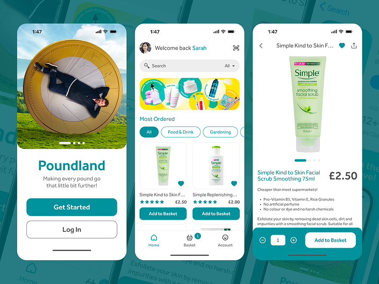
Poundland - App Experience
Every once in a blue moon, we find ourselves wandering into Poundland to explore its offerings, but today it struck me:
📱 Poundland lacks a dedicated app
📱 No loyalty card integration with Apple Wallet
Intrigued by this thought, and like all design exercises I give myself for fun, I like to delve into how such features could potentially look, what users might expect given typical UX conventions, whilst keeping to brand to not delve too far away from the customer's association with it.
Adding an app browsing experience to the entire store, similar to web, as well as an introduction of marketing push notifications could make the brand itself reach further audiences, acquire more customers and allow for users to quickly switch between competitors in their phone for the best price.
Many brands like Boots, Superdrug and more have successfully integrated loyalty cards into the Apple Wallet, offering convenience, just like how you can hold your travel passes when passing through airports.
These are great particularly when you open apps in-store but they fail to load in areas with poor signal. Even Toby Carvery has one!Could Poundland benefit from a similar approach? Would it foster greater customer retention and drive sales if they went down a points route? Do people prefer to browse the current loyalty app at home before going in-store?
Combining both my experience in app design and digital signage, I can start to imagine from a holistic perspective how the pieces of Poundland having a dedicated app would come together.
💡 What could advertising look like?
💡 What would the app icon be like?
💡 What would the app store focus on?
From idea to design, I always like to keep the 3 second rule in the back of my mind: Who is it? What is it? What do you need me to do? As a viewer I should be able to digest these in under 3 seconds otherwise one could argue that the design, and overall promotion, has failed.
It's fun to give life to something you only thought about when standing in a store.


