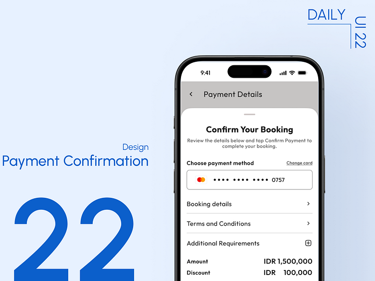
Day 22: Payment Confirmation
This is day 22 of my 90-day Daily UI Challenge!
Today's focus was on designing a payment confirmation screen. This design prioritizes clarity and user reassurance, featuring a prominent checkmark icon, a clear breakdown of the payment details, and a "Booking Confirmed" message.
More by Benny Afrizal View profile
Like

