High Conversion Mobile Landing Page
In this post, I'll share my strategy for a High Conversion Hero Page case study focusing on Conversion Rate Optimization (CRO) principles. The objective is to create a landing page that maximizes user conversion.
Design Rationale
In this design rationale for the homepage, I'll outline key strategies and elements implemented to optimize user engagement and conversion rates. Each component is carefully crafted to grab attention, communicate value, and drive user interaction effectively.
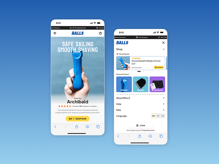
Homepage
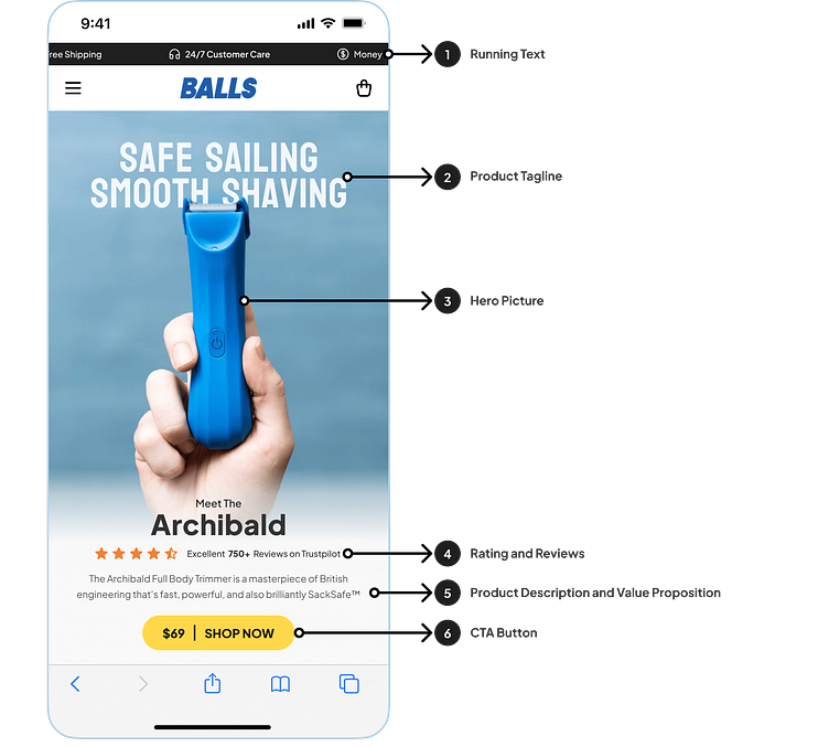
Running Text:
Highlights key selling points with dynamic text for visual appeal and efficient information delivery.
Product Tagline:
Positioned at the top to capture user attention, communicate value, and create an emotional connection.
Hero Picture:
Emphasizes simplicity and purposeful elements to avoid distractions and maintain focus on essential content.
Rating and Reviews:
Showcases social proof and trustworthiness, with the quantity of reviews serving as a significant indicator for potential customers.
Product Description and Value Propositions:
Provides a brief, clear section outlining the product, its functions, and the problems it solves, aiming to establish shared understanding, differentiate from competitors, and boost conversion rates.
CTA Button:
Designed to be prominent with high contrast, signaling importance and encouraging engagement, while pricing information helps build trust and manage customer expectations.
Menu
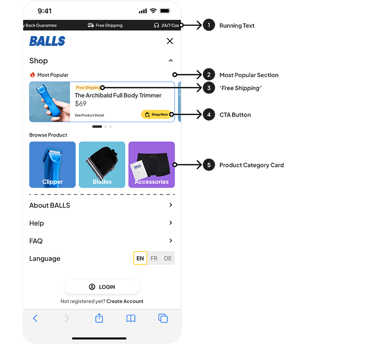
Running Text:
Integrating running text to highlight our Unique Selling Propositions (USPs) continuously.
Most Popular Section:
Showcasing "best sellers" to build buyer confidence through social proof and create a sense of urgency or FOMO.
'Free Shipping' Tag:
Adding a 'Free Shipping' tag to product cards to increase perceived value and attract potential buyers.
CTA Button:
Using a contrasting color to emphasize the CTA's importance and encourage user engagement, with strategic placement for visibility.
Product Category Card:
Incorporating illustrations to visually enhance product categorization, improving the user's ability to navigate the menu page efficiently.
Closing
In concluding our dive into the intricacies of the High Conversion Hero Page case study, I trust you’ve found inspiration in the fusion of creativity and functionality. May these insights serve as a beacon for creating user interfaces that not only shine but also elevate conversion rates. Cheers! 🖥️🌟
