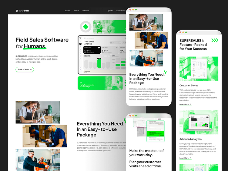
Landing Page for POS Company
I recently had the pleasure of designing a user interface for a company landing page that strikes the perfect balance between professionalism and approachability, and I'm excited to share the journey with you. 🚀
On this project, I crafted both desktop and mobile web designs, adhering to responsive design principles. While I'll be showcasing the desktop version in this article, you can explore the mobile web design through the prototype link provided in the last section.
Starting with the header, I wanted to create a warm, inviting atmosphere. It needed to showcase the technical prowess of the POS system while also radiating human warmth. Imagine walking into a store where the technology feels advanced yet friendly, like a familiar face welcoming you in.
Moving on to the introduction section, I knew it was crucial to showcase the POS system in action. I opted for authentic imagery that captures the essence of real-life scenarios, steering clear of the typical 'stock image' feel. The goal was to make the POS system feel like a natural part of a salesperson's daily workflow, seamlessly integrated and effortlessly efficient.
In the key features section, I aimed for a clean, systematic layout that highlights the standout features of the SUPERSALES platform. Each feature was given its own space to shine, yet all were tied together cohesively to provide visitors with a comprehensive overview of what makes the app essential for success.
Finally, the route planning capability section was all about emphasizing efficiency and optimization. I wanted to show how the POS system empowers salespeople to manage their performance and workload effectively, all while identifying new opportunities. It's about making their work lives easier and more productive.
Simple Animation
To add a dynamic touch to the design, I incorporated animations that I created using Lottie, which are more than just eye candy—they're the heartbeat of the page. These animations make the user experience dynamic and memorable, enhancing the overall interactivity and engagement.
To see how these animations bring the design to life, check out the prototype. Additionally, I've created a mobile web version of the design, which you can explore here.
So what do you think about this design?
I hope you enjoy this glimpse into my design process for a POS company's landing page. It's been a rewarding journey, and I'm thrilled to share the final result with you all! Let me know your thoughts in the comments below.


