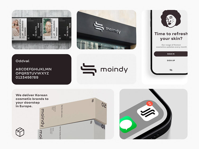
Moindy Logo & Branding
Moindy | Project description
The logo for Moindy, designed with the sleekness and precision that echoes the brand's ethos, embodies simplicity and modernity. Set against a dark background, the white, stylized typography suggests accessibility and clarity. The emblem, reminiscent of both Eastern calligraphy and contemporary Western design, suggests a bridge between cultures, fitting for a company that aims to bring Korean beauty products to European shores. Moindy's identity is thus represented as both a gateway and a curator of beauty, delivering authenticity and choice to the discerning consumer.
More by Wayone by Vic.R View profile
Like

