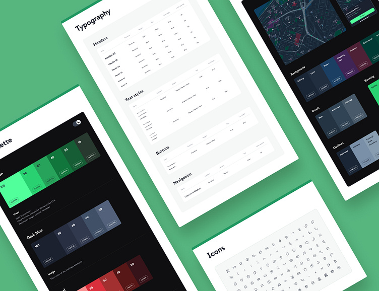
Design System vol.1
Design systems are like fingerprints - each unique and tailored to a specific purpose. In some cases, a simple style guide may be enough, while a more complex system may be required to ensure the project is cohesive from top to bottom. These are a few tips that have worked well in our experience.
Colors
When it comes to creating a color palette for a project, it's best to keep it simple and use as few colors as possible. Avoid creating extra shades just for the sake of making the color palette look more diverse.
Speaking of colors, our biggest challenge was customizing the map used in the app so that it wouldn't blend in with other interface elements, while still matching the established color scheme that corresponds with the product branding. We had to experiment and try out many different color combinations to achieve the desired effect. Unfortunately, we don't have a magic formula for creating the perfect color palette, but we'll keep trying!
Typography
For top-notch typography in your project, use https://typescale.com/ It establishes perfect text hierarchy. Highly recommended!
Icons
Keep in mind these tips for choosing icons for your projects to make your design process simpler and faster:
Clarity: Choose clear, recognizable icons.
Consistency: Maintain a consistent style throughout. Utilizing a ready library is a good starting point!
Simplicity: Keep icons simple so they're readable on any screen.
___________
Thanks for stopping by! 👋
We're available for new projects! Send us a message at hi@rst.software


