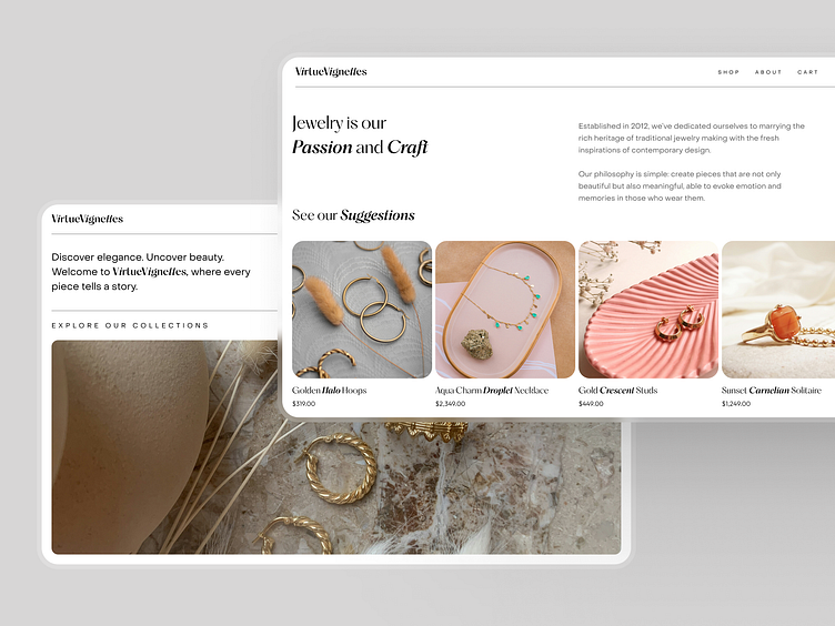
Jewellery E-commerce Landing Page Concept
Our sleek and sophisticated landing page for a designer jewelry shop focuses on showcasing each product's beauty. This approach allows customers to browse, find, and purchase their perfect piece without any distractions. We combined modern minimalism with elegant design to create a truly luxurious shopping experience. The Antiqua and Grotesk fonts are a perfect match for such a concept.
Have a beautiful idea in mind? Let's collaborate!
design@shakuro.com
What’s more, we used a unique way to structure the page content. There are minimal margins from the edges. Thin lines, non-standard shapes, uneven arches, steep roundings, and unique button designs help us support the elegant style. They guide the customer’s eyes from one piece of jewelry to another.
Why did we separate the two sections of the page on these shots? Such a presentation highlights the concept and its style, so you can notice how the shape changes from screen to screen.
Shakuro
We are a web and mobile design and development agency. Making websites and apps, creating brand identities, and launching startups. Our goal is to help companies build relationships with their customers online through great design and technical performance.
Let's work together!
design@shakuro.com
Discover more about us at shakuro.com


