Roots haircare
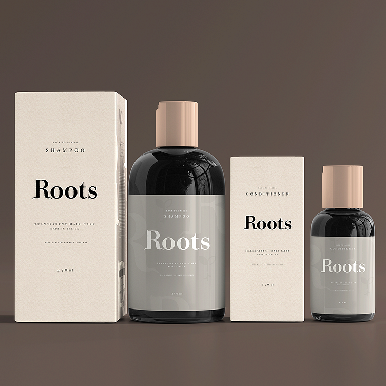
Roots aspired to establish itself as a leading brand in the organic haircare market. With a commitment to authenticity, premium quality, and transparency, Roots aimed to offer consumers a range of organic haircare products that were both effective and environmentally conscious.
Objective:
The primary objective was to develop a distinctive brand identity and logo that would reflect Roots' core values of authenticity, premium quality, and nature-inspired simplicity while emphasising transparency in ingredient sourcing.
Approach:
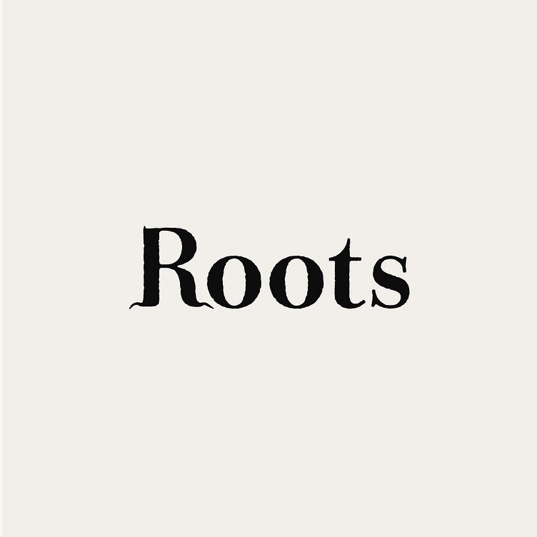
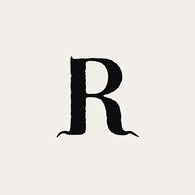
In-depth research into the organic haircare market, consumer preferences, and competitor branding informed the design process. Inspired by the concept of organic and natural ingredients, I conceptualised a logo that merged the letter 'R' with the roots of a tree to symbolise nature and rootedness.
Concept Development:
The concept of the logo centred around capturing the essence of nature and organic authenticity. By incorporating the letter 'R' into the roots of a tree, the logo symbolised the brand's connection to nature, conveying a sense of grounded-ness, growth, and organic purity.
Design Execution:
Drawing upon minimalist design principles, I crafted a clean and elegant logo featuring a stylised 'R' intertwined with the intricate roots of a tree. The choice of earthy tones and organic stylising reinforced the brand's commitment to natural ingredients and sustainability, while maintaining a premium aesthetic.
This project exemplified the successful integration of organic and natural themes into a distinctive brand identity. the logo and branding effectively communicated the brand's commitment to nature-inspired simplicity, organic authenticity, and environmental sustainability, positioning Roots as a trusted leader in the organic haircare industry.
