BRANDING / PACKAGING DESIGN
The Blue Heron
They say men age like fine wine.
And women...like milk? I don't know.
But one thing's for sure: nothing tastes better like aged wine 🍷.
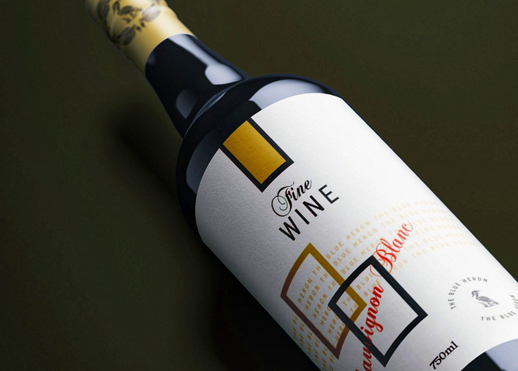
Introducing 'The Blue Heron.'
Everything about this wine is extraordinary. It was created using a unique proprietary courage method, yielding a one-of-a-kind flavor profile. This wine was stored for 50 years in cellars, further enhancing its flavor. It's a piece of history as much as it's a bottle of world-class wine. It's rich, and my, oh my, the taste! You gotta drink it to believe it.
The Client
The client intends to sell this wine in small batches yearly and the intent is to build a brand and a sales mechanism that, over time, enable the wine to increase in value. The client tasked me with creating a name and packaging that convey this wine's uniqueness and intrinsic value.
Thus, I've chosen the name 'The Blue Heron', as it conveys the uniqueness of the brand. If you've figured it out, the color blue is rarely, if ever, a constant thing that appears in nature (less than 1 in 10 plants have blue flowers, and far fewer animals are blue). And the blue heron is seen as a symbol of patience and good luck.
This is indeed a wine that is a once-in-a lifetime kind of thing. And once it's gone, it's gone forever.
The flavors you're looking at are Sauvignon Blanc, Pinot Grigio, and Rosé 🍾.
Enjoy!
P.S. I created a brand guideline on the same. If you'd like a copy, here's the link to download the FREE version 👇.


