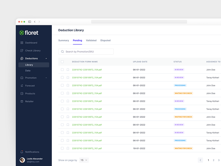
Presenting complex data in a smart and user-friendly way
The project’s main challenge was to present lots of diverse and complex data in an easy-to-get manner.
After analyzing the competitors, we figured out that many of them struggle with smart data presentation. For instance, the checks are often separated by different charts, which looks confusing. Some features of the app were in the ideation stage, while some were already developed but looking too complex.
Get in touch to hire Eleken SaaS designers
Let us help you design, fix or scale your SaaS product!
More by eleken View profile
Like
