Oat Fields Oat Milk
Oat Fields is an oat milk company I created. Their oat milk is rich and creamy, with more protein and fiber than most milks.
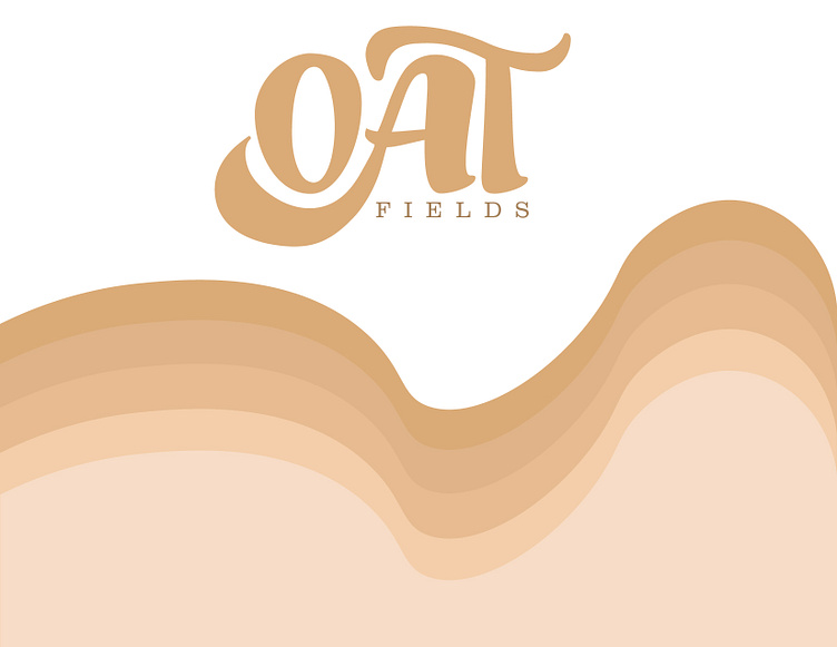
The warm, tan colors I chose for the logo feel like fresh oats. The style and form of the letters 'OAT' look like a cup of oat milk. Creamy and full-bodied. This slightly sweet milk tastes the best out of all the others, and I wanted that to show within my designs
This is the carton I created for the packaging of Oat Fields Oat Milk. I wanted the colors to give off a natural, eco-friendly vibe. At the top is where I listed what the oat milk is free from, and it repeats around all four panels. I put the flavor, 'Original', on every side of the carton so there is quick distinguishing for the consumer. If the shelf isn't front faced, the consumer will be able to read which oat milk they are about to buy no matter the side it's showing.


