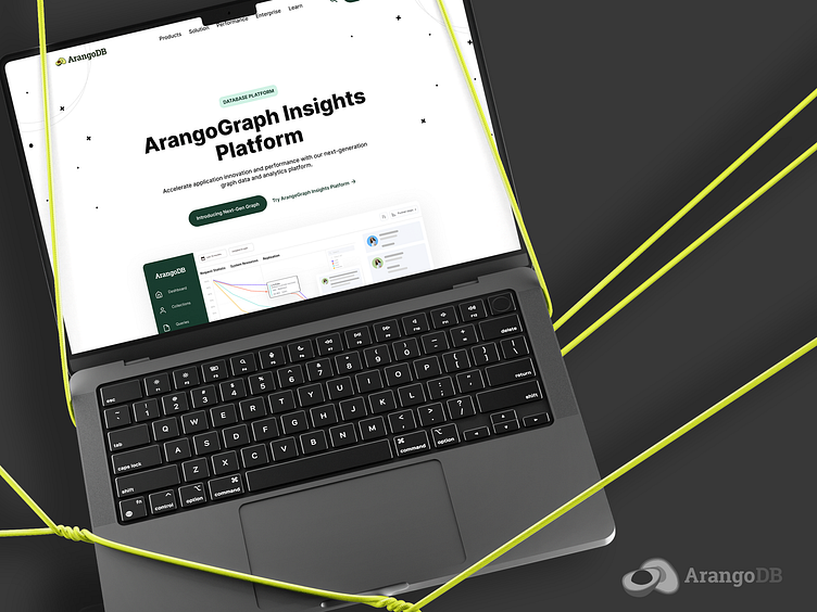
ArangoDB - Home page redesign
Focused on user-centric design, I embarked on a journey to create a seamless interface that speaks clarity into the intricate world of graph databases. Through iterative design exploration, the solution unfolded as a balance between technical prowess and intuitive navigation.
Data Visualization: Crafted an ecosystem of charts and graphs that not only present data but tell the story behind the numbers.
Navigation: Streamlined for efficiency, enabling users to dive deep into data without losing their way.
Color Scheme: Chose a palette that reflects stability, trust, and innovation, making data interaction not just informative, but also visually pleasing.
Responsive Layouts: Ensured a fluid experience across various devices, keeping user engagement consistent and focused.
Result: The ArangoGraph Insights Platform stands as a testament to design that empowers users. By demystifying data analytics, it provides a gateway to insights that drive informed decisions.
Reflection: This project was a beautiful symphony of design and data, a platform where form meets function in the most harmonious way. It's a reminder that in the complexity of data, there is beauty, and in the challenge of design, there is opportunity.


