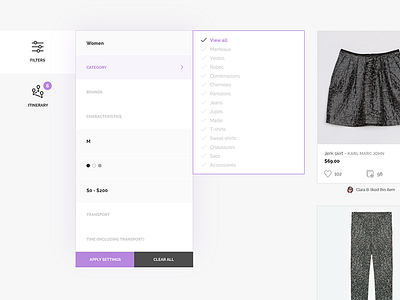
Shopping filters
The filters were a bit harder to design than the map. They need to be viewed in a little space because they are fixed in the page while the user scrolls. There are a lot of filters, so I had to find an easy way to display them all.
I chose to design them in these two boxes. The filters that have been already changed by the user are in black type with gray background, the filters that haven't been touched by the user are less visible, in gray type with white background. This is a visual way to facilitate the filters' use.
More by Emmanuelle Bories View profile
Like

