Doctor Dashboard
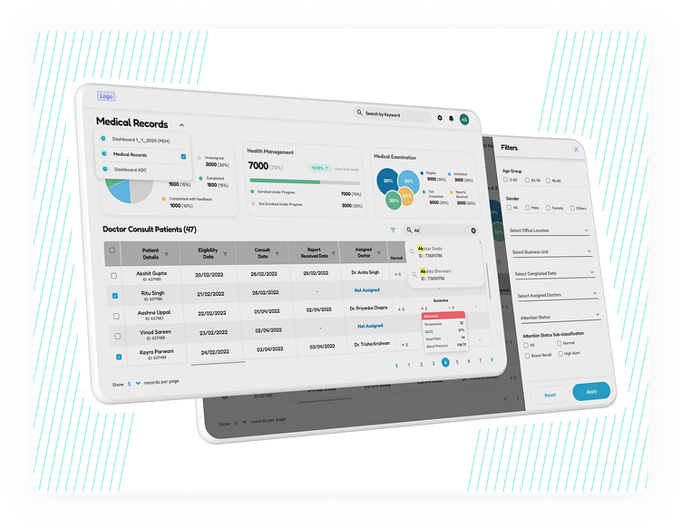
In this particular use case, I focused on creating a doctor dashboard view that empowers efficient and informed patient care. This project stemmed from the understanding of the challenges faced by doctors, particularly those in their middle ages, who may have varying levels of experience with modern technology. The Human-Centered Design (HCD) approach guided every step, ensuring the interface is intuitive, accessible, and fosters a seamless workflow.
Understanding Doctor Needs :-
Through user research, I delved into the daily routines of doctors. Interviews revealed a need for a single platform that consolidated patient medical records, examination results, and health management tools. Doctors also expressed a desire for robust filtering capabilities to quickly access specific information and track patient consultation history in detail.
Balancing Technology and User Comfort :-
The key challenge was striking a balance between technological advancements and user comfort, particularly for doctors who may not be tech-savvy. Here's how I tackled this:
Intuitive Interface: I prioritized a clean and uncluttered layout with clear hierarchy and minimal visual clutter. Large, easily identifiable icons and navigation buttons ensure quick access to various functionalities.
Focus on Readability: I opted for a high-contrast color scheme with easy-to-read fonts to minimize visual strain, especially for doctors who might require reading glasses.
Minimal Learning Curve: The dashboard utilizes familiar UI elements and common design patterns, allowing doctors to navigate and perform tasks intuitively without extensive training.
Heuristics for Optimal User Experience :-
Nielsen's heuristics played a crucial role in crafting an optimal user experience:
Visibility of system status: The dashboard consistently provides feedback through progress bars, loading indicators, and status updates, keeping doctors informed of ongoing tasks.
Match between system and the real world: Real-world metaphors are used for icons and labels, ensuring intuitive understanding of functionalities.
User control and freedom: Doctors can easily undo actions, filter results based on various criteria, and customize their view for optimal workflow.
Error prevention: The system incorporates clear error messages and validation mechanisms to prevent incorrect data entry and ensure data integrity.
Recognition over recall: Clear labels and intuitive iconography minimize the need for memorization, allowing doctors to focus on patient care.
Data Visualization for Informed Decisions :-
The dashboard empowers data-driven decision making by incorporating:
Detailed Tables: Doctors can access patient medical records in comprehensive tabular format for precise analysis.
Interactive Charts: Visualizations like bar graphs and line charts present trends and key metrics in an easily digestible format, facilitating quick identification of potential health concerns.
Robust Filtering for Efficient Access :-
Filter patients by name, medical condition, date of visit, and other relevant parameters.
Drill down into specific details within patient records for a more targeted review.
Save and reuse frequently used filters to streamline workflows.
Conclusion: Empowering Doctors, Enhancing Care :-
This doctor dashboard represents the culmination of user-centered design principles and a deep understanding of doctor personas. By prioritizing intuitiveness, accessibility, and data-driven insights, this tool empowers doctors to deliver efficient and informed patient care.
--------------------------------------------------------------------
Do check out my other work & let me know how y'all found this one ! 😄✌❤
