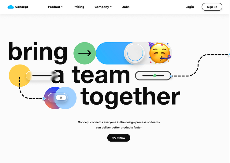
UI Design: Professional Website Hero
Hello! 🥳
Day 002 of getting better at Figma!
Today I wanted to create a more static design, here is an example for a professional website.
The challenge here was only to play around with the effects like shadows and blur backgrounds, also with the gradients and colours.
What do you think?
_______________________________________
Personal website: www.erifernandez.com
Available for new projects, get in touch📨: eri.bfern@gmail.com
In another way: LinkedIn
More by Eri Fernandez View profile
Like
