Flexy | Active Wear
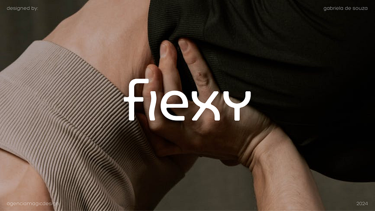
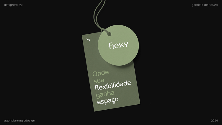
Flexy
A brand created and designed to bring comfort and movement during physical activity. More than a clothing brand, Flexy encourages movement, freedom and expressiveness of the body, prioritizing body breathing and movement, without any limitations or discomfort.
Challenge
There are many ways to move your body nowadays and each of them requires specific and functional clothing. Flexy's proposes to centralize comfort and movement with clothes that suit any sport.
Studies from Loughborough University and the University of Sydney show an increase of up to 5% in muscle strength and a reduction of up to 12% in fatigue with the use of quality, breathable clothing during sports.
Another study shows that wearing sports clothing that promotes flexibility and body freedom reduces the risk of injuries by 20%, in addition to increasing levels of well-being and comfort, thus reducing feelings of stress and anxiety during sports.
This brand needed to show that basics work, all you need is quality.
You don't need fancy solutions and stylish clothes, you need to put on clothes and feel like you're wearing nothing.
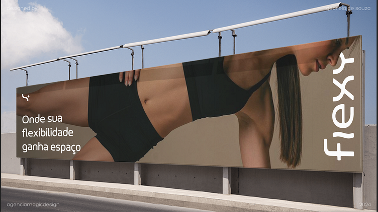
The challenge here was to represent not the clothing itself, but the feeling it causes: Lightness and freedom.
Construction
I used the following words as the basis for this visual identity:
• Body
• Movement
• Flexibility
• Organic
The idea is to represent the natural, balanced body and bodily freedom of the brand. When we add the circle, the waves become people, in a subtle and light way, just like wearing a Flexy piece.
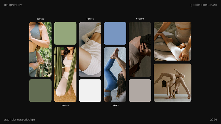
Colors
The natural, healthy and organic was faithfully represented through colors such as blue, green and grayish white. It is impossible to look at these colors and not remember natural elements such as forests, rocks, lakes and clouds. All of these are elements found in nature that have organic forms and that exist naturally, without any human intervention.
Fonts
They dance. The waves and movement of the font faithfully represent the brand message in its entirety. Like every curve and movement of the body, fonts are in constant motion. The thicker strokes bring the necessary importance and relevance to the brand's visual set, without losing lightness and expressiveness.
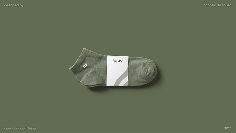
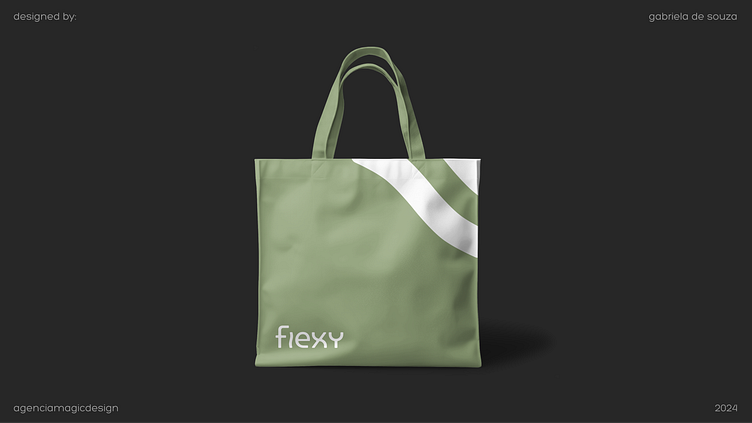
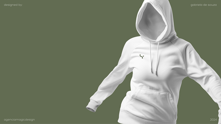
Products
The products follow the natural line in their raw materials and have a minimalist and neutral design, always connecting with the naturalness of the entire visual set.
Breathing and the use of colors in their entirety make all the difference when developing this brand's products and that is what makes it remarkable for consumers.
Positioning
For all bodies, for all ages, Flexy's positioning is inclusive, positive and full of good energy. Flexy is a mature brand, for determined people who care about life, the environment and their daily choices.
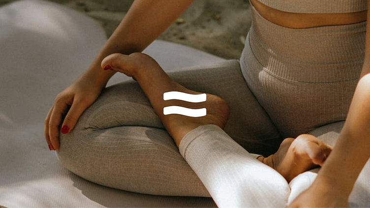
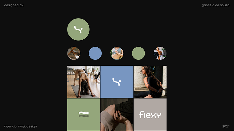
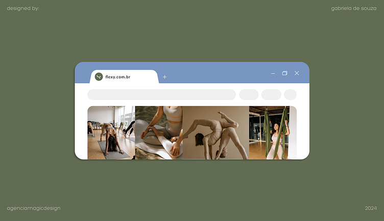
Photography
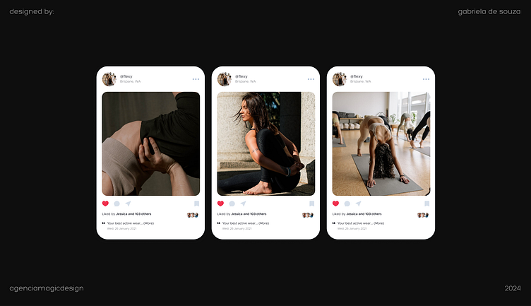
Natural lighting, sun and daytime photos. Always showing movement, continuity and expressiveness through bodies.
The pieces never appear alone, they are always associated with models since the idea is to show that the piece of clothing, from the moment it is worn, becomes one with the person wearing it. There is no free body without a Flexy part, just as there is no Flexy part without a free body.
Close-up photos and zooms in on the textures are the brand's trademark, the small details of each piece make all the difference in the design and online promotion.
Communication
Communication is positive, welcoming, mature and human, it is not delicate or cute but direct and decisive. Flexy's communication doesn't go around the edges, it speaks directly to people who are aware and confident of their choices. Wearing a Flexy piece means having attitude, freedom and expression through your body.
Did you like this project?
Be sure to show your appreciation and encouragement.
