Daily UI Challenge : Day 6 (Landing Page)

This landing page design for StreamBoost, a new streaming platform, focuses on clear communication and user engagement to drive subscriptions. Let's dive into the key UX principles applied
Hero Section:
Background Image: A cinematic collage showcasing a variety of movies and shows.
Headline: "Millions of movies, shows, and originals" - Instantly grabs attention and communicates the content library.
Subheading: "Anytime, Anywhere" (with icons) - Emphasizes accessibility across devices.
Clear CTA: "Sign Up Now" - Prominently positioned, guiding users towards action.
Pricing (Note): "Plans start from..." (mention starting price) - Provides users with a pricing reference point.
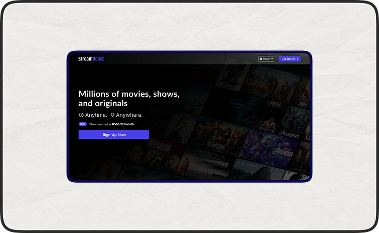
Visual Hierarchy: The background image dominates, followed by the prominent headline and CTA. Icons in the subheading add subtle visual interest.
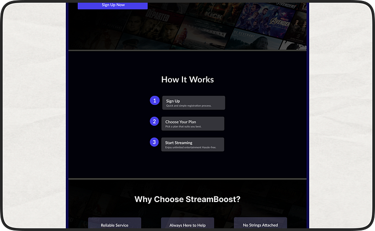
Benefits Below the Fold:
"How It Works" section: Three clear steps with concise text and icons guide users through the sign-up process.
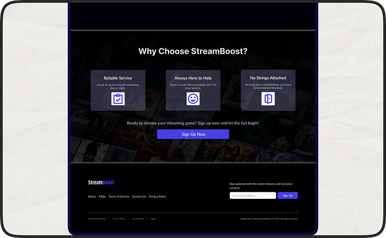
"Why Choose StreamBoost?" section: Three key reasons with icons:
Reliable Service (icon) - Assures users of streaming stability.
Always Here to Help (icon) - Highlights responsive customer support.
No Strings Attached (icon) - Emphasizes the free trial or flexible plans.
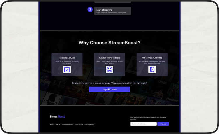
Compelling Call to Action: "Ready to elevate your streaming game? Sign Up Now and let the fun begin!" - Creates excitement and encourages users to subscribe.
Footer CTA: Repeats the call to action alongside other essential links.
This landing page design utilizes clear communication, user-friendly features, and a strong visual hierarchy to effectively convert visitors into StreamBoost subscribers.
#ui #ux #design #landingpage #streamboost #streaming
