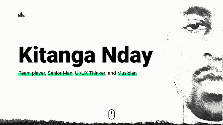
Kitanga.dev Website Mockup (2022)
So, it's been a wild couple of years, been quietly getting used to being a creative. Previously, I only cared about coding and UX, now I'm getting into a more creative role.
This is one of the first designs I did where I felt I was getting more confident in using Figma and in creating a style. I had moved from Lunacy (a windows version of SketchApp), so the transition wasn't steep.
Anyways, below you'll find some designs for the loading screen, different iterations of the Work section/page, and an unfinished dive into what the blog page could have looked like.
Ended up with the above design for the loading screen. Have to say, I was shocked at how many people almost didn't see the "Start" button. Most users clicked on the button, but some missed it. And it seemed to only get worse, so I recently made some changes and made the entire preloader screen clickable.
Does anyone else struggle to find good quality grudge textures. I felt like the one I had might look terrible on a MacBook. It didn't but still, you never know. Fun fact, this was the most skipped section of my site, no one cared about it. The equal visual weight of all buttons probably didn't help. Maybe next time I'll try 3 items instead of 4. Better chances of a choice being made, probably. But for now, I've moved it to the bottom of the page, I'll explain in the next section.
The work section was an interesting one. I found myself iterating the most here. Started with the first image, then ended up choosing the second design as the final implementation. The third was just an exploration.
But something I made a silly mistake of not realising is that almost everyone is on this site to see my work. That single fact lead to everyone skipping over the socials section and bee lining it to the works section. I thought most visitors would want to see my Stackoverflow page, or my UX stackexchange account, but nope, they went straight to my projects list.
So, I moved it up the page and made sure it's header was peaking above the fold.
I had just come from making a demo of Material UI 3s Carousel. I figured I could use the broken code on my blog section. It didn't happen, I didn't implement this. No data on it, but I have reserved space for it on the next version of my site so yea, fun times ahead.


