Travel Agency UI Design
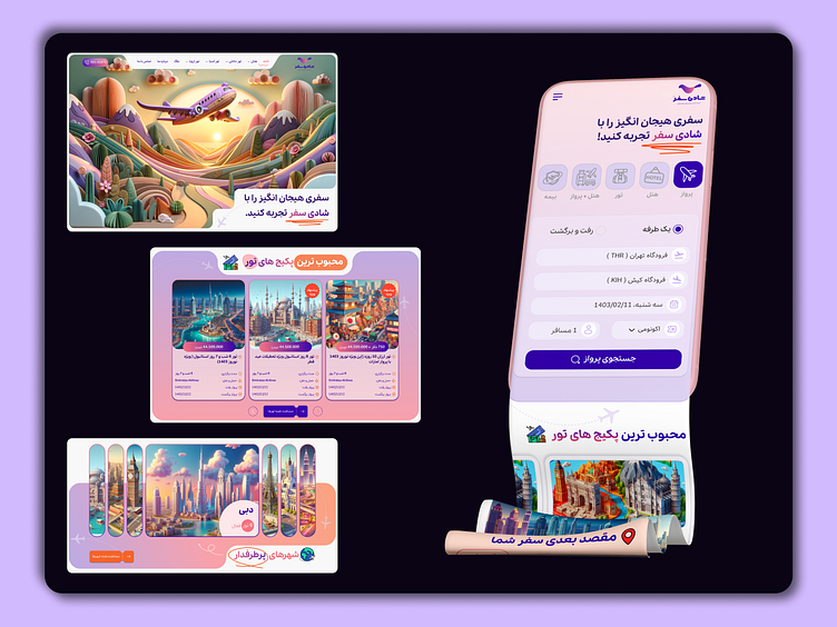
🌟 Desktop & Mobile Views: A Seamless Experience 🌟
In this elegant design, I’ve seamlessly blended the desktop and mobile experiences. Let’s dive into the details:
Desktop View:
The hero section features a stunning high-resolution image that immediately draws the user’s attention.
A clean and minimal navigation bar sits at the top, providing easy access to essential pages.
Subtle animations enhance the user journey, creating a delightful browsing experience.
The content grid elegantly adapts to larger screens, maintaining readability and visual balance.
Mobile View:
The mobile version prioritizes simplicity and usability.
The navigation menu collapses into a sleek hamburger icon, conserving screen real estate.
Bold typography ensures legibility, even on smaller screens.
Touch-friendly buttons and intuitive gestures facilitate effortless navigation.
Elevated Aesthetics: The design exudes elegance with its subtle gradients, reminiscent of a sunrise over distant mountains. The purple header sets the tone, invoking a sense of adventure and wanderlust. It’s as if the user is stepping into a luxurious travel lounge, ready to explore the world.
Seamless Navigation: The intuitive layout ensures that users can effortlessly navigate through the site. The white icons atop the header promise quick access to essential features. Whether it’s booking flights, discovering destinations, or reading travel tips, everything is just a tap away.
Global Exploration: The world map icon subtly hints at boundless possibilities. Users can traverse continents, from the bustling streets of Tokyo to the serene beaches of Bali. Each destination section beckons with vibrant imagery, enticing travelers to embark on their next adventure.
Destination Showcases: The colorful images steal the spotlight. Imagine sipping coffee in a Parisian café, gazing at the Eiffel Tower, or snorkeling in the crystal-clear waters of the Maldives. Each section tells a story—a blend of wanderlust and practical information.
Persian Elegance: The use of Persian text adds an exotic touch. It’s not just about booking flights; it’s about immersing oneself in culture, language, and local experiences. The typography dances gracefully, mirroring the calligraphy found in ancient souks.
Testimonials in Purple: As users scroll down, they encounter a purple testimonial section. Real travelers share their heartfelt experiences—the thrill of summiting Everest, the warmth of Moroccan hospitality, or the joy of a Tuscan sunset. It’s a mosaic of memories.
Offers and Packages: The final stretch reveals a treasure trove of exclusive offers. Whether it’s a romantic getaway, a family adventure, or a solo escapade, the orange buttons invite users to explore further. The anticipation builds—a ticket to paradise awaits.
🔍 Explore the Interplay:
Scroll down to see how the design gracefully transitions from desktop to mobile.
Notice how elements adapt, ensuring a consistent brand experience across devices.
Desktop Design.👇🏼
Responsive view.👇🏼


