Chicago Botanic Garden Rebrand
Chicago Botanic Garden logo and visual identity
The Chicago Botanic Garden is a world-renowned living museum and conservation science center that attracts over a million visitors each year. With a membership of more than 50,000, it has one of the largest membership bases for a botanic garden in the United States.
Around for over 50 years, The Garden was ready for its brand to reflect who it is today—a spectacular 385-acre living campus with science, educational, and community programming. We teamed up with our strategic partners at The Scratch Collective to develop a modern, fresh, and inclusive design system that speaks to The Garden's rich history while encompassing the entirety of its work.
More Than A Pretty Face
The Garden wanted a new brand to show the world who they really are while reaching a larger, more diverse audience.
The new identity needed to look, feel, and sound bold, modern, inclusive, friendly, welcoming, fun, inspirational, and confident.
After months of listening, learning, collaborating, conceptualizing, designing, and redesigning, the new logo emerged.
The Typeface
The new typeface was inspired by The Garden’s rich history with modernism. Early on, The Garden solidified its commitment to a modernist aesthetic, and throughout its existence, architects have used modernist techniques in the design of its buildings and landscaping.
Modernism In The Garden
mod•ern•ism
a style or movement in the arts that aims to break with classical and traditional forms.
The Old Mark
The previous logomark depicts a lotus, an invasive species The Garden felt was not a relevant representation of itself or its work.
The New Mark
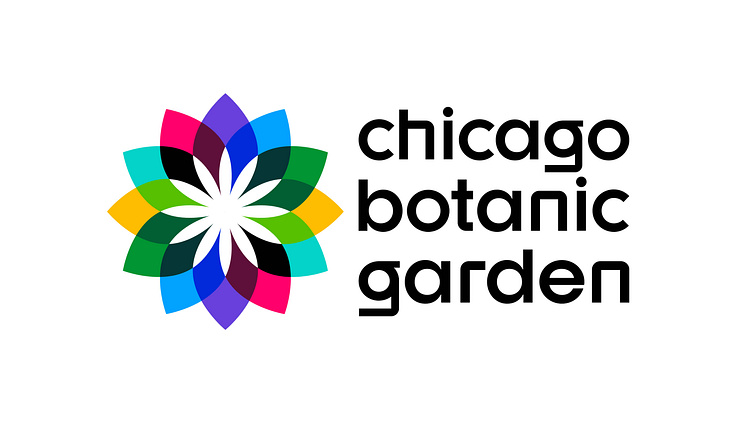
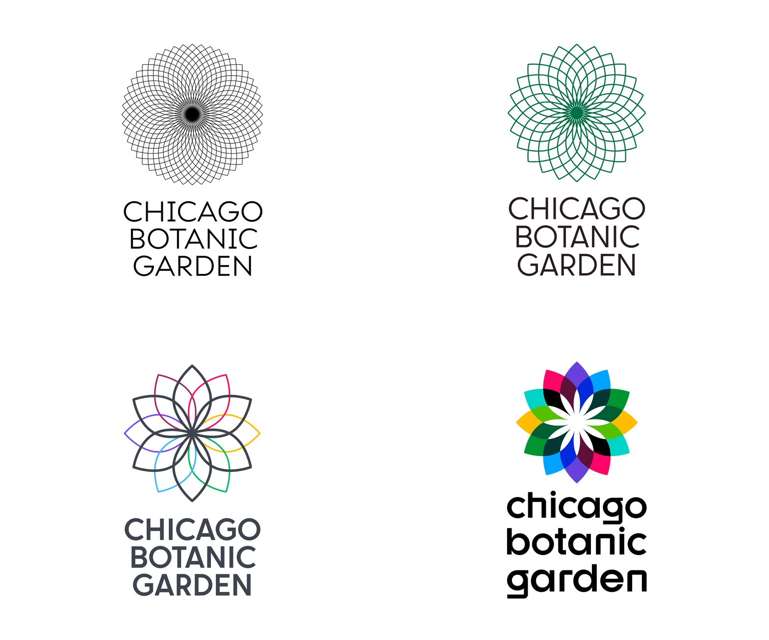
The new logomark is an abstract depiction of the coneflower, a native prairie plant that ties directly to The Garden’s horticultural research & work.
Iterations
The mark was originally inspired by the complex center of a coneflower, with a nod to the Fibonacci sequence. While this delicate and ornate visual spoke to The Garden’s scientific work, it evolved into to a more simplified, responsive variation that could retain its detail even at smaller sizes.
The color palette started off simple, but was extended to provide vibrance, symbolism, and functionality as a system for The Garden's programming.
While a modern typeface was always considered, lowercase letters were used to provide warmth.
Tagline
Three powerful words were developed to speak to The Garden’s mission.
Tagline developed by The Scratch Collective.
Old Color
The previous color palette primarily used this non-accessible green, which limited the brand and was difficult to read as type.
The green fails both the AA and AAA Web Content Accessibility Guidelines when used with the color white.
New Color
The new color palette hosts a wealth of vibrancy and is utilized for visual distinction between The Garden’s robust programs and offerings.
The new color palette includes variations that pass the Web Content Accessibility Guidelines.
Inspired by The Garden Itself
Each new color was inspired by an installation by artist Jo Hormuth, who took photos of The Garden’s main campus for a year. Eight mosaic-like panels were created from these photos that demonstrate The Garden’s vast array of color and how they change with the seasons.
“Better Grammar-Garden” by Jo Hormuth can be found in the Regenstein Learning Center at the Chicago Botanic Garden.
Programming
A brand architecture system was developed to organize The Garden’s many offerings. Along with the main campus, three existing entities were selected to represent the science, learning, and community programs. The new color system was crucial to help identify and differentiate between them.
Brand Architecture Strategy lead by The Scratch Collective.
Bringing the Brand to Life
Click here to see how the brand was brought to life through signage, merch, and print collateral.
Style Guide
Click here for our 88-page style guide that holds the standards and rules to maintain brand consistency across all of The Garden’s channels. It defines the framework for visual, verbal, and written communications and sets the foundation for the brand to grow and thrive.


