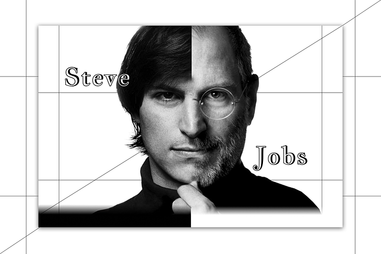
Steve Jobs / Landing Page UI/UX
The project was created to tell what Steve Jobs was like, about his achievements and great contribution to our society. The project also shows the evolution of the Macintosh and all major iPhone models.
American entrepreneur Steve Jobs sought to ensure that the product had nothing superfluous, was minimalistic and at the same time convenient and understandable for the user, so the project was created according to the same principle, while emphasizing all the nuances and advantages of an industrial designer.
The goal of this project is to show a person's character only through fonts, without using color or photographs.
To emphasize typography, the project uses strict and restrained colors - black, white, and gray, as well as straight and clear lines, emphasizing the specificity, directness, and discipline of Steve Jobs.
Typography
Jacques Francois Shadow is a font with shadow used for the main screen, it symbolizes the clear imprint of Steve Jobs in our lives and our hearts, because Apple products turned out to be truly beautiful, and this is the main merit of Jobs.
Javanese text is a beautiful but strict serif font that fits perfectly with the style of the project.
Montserrat is a simple sans-serif font that is light and easy to read, the words are distinguishable from afar and the letter designs do not merge.


