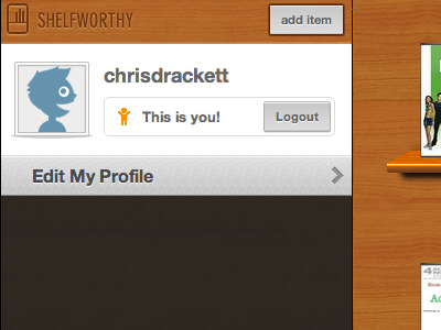
Profile work in progress take 3
Another take, this time with a white background.
Almost seems too "bright" to me, but maybe an improvement? Also I think I need some sort of separation between the list items (edit) that scroll and the profile that does not...
More by Chris Drackett View profile
Like

