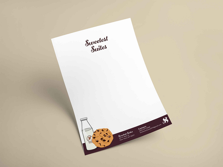
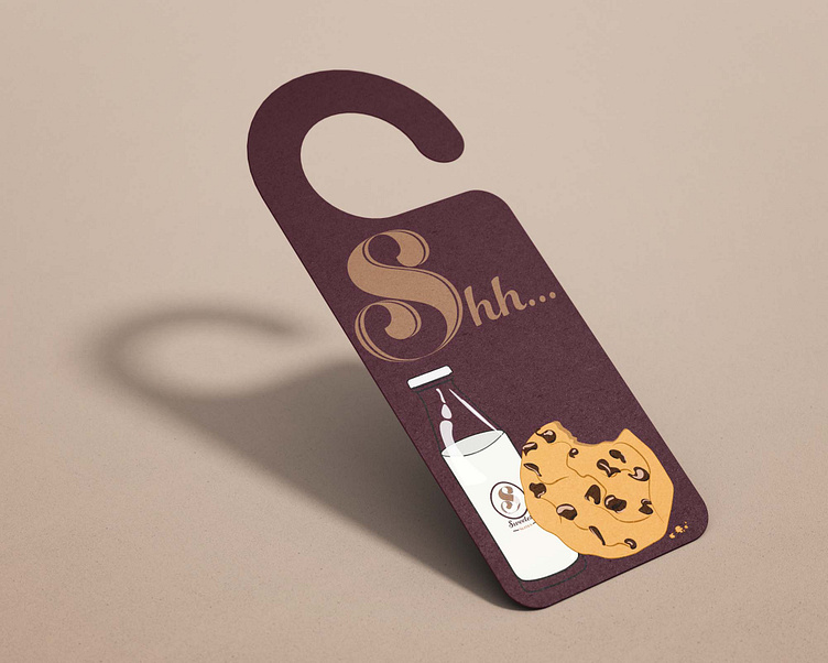
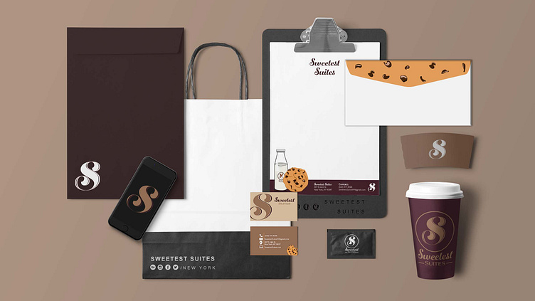
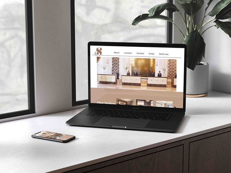
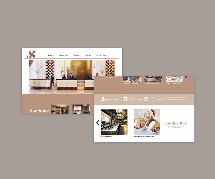
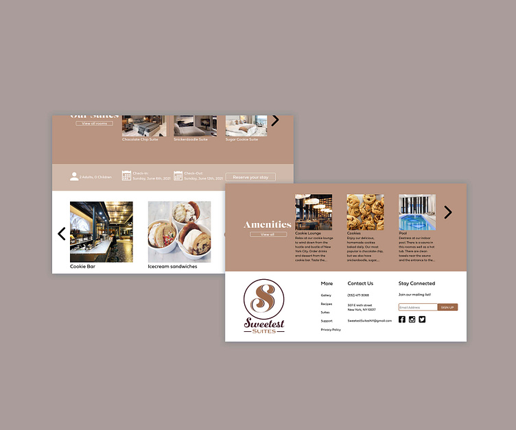
Sweetest Suites
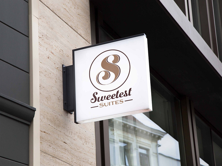
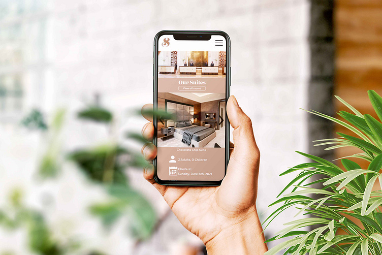
Sweetest Suites is an upscale, fictional hotel that serves milk and homemade cookies all day and night. Order room service or take a trip to the twenty-four hour cookie bar, where you can indulge yourself in the sweetness of chocolate chip cookies or other baked goods.
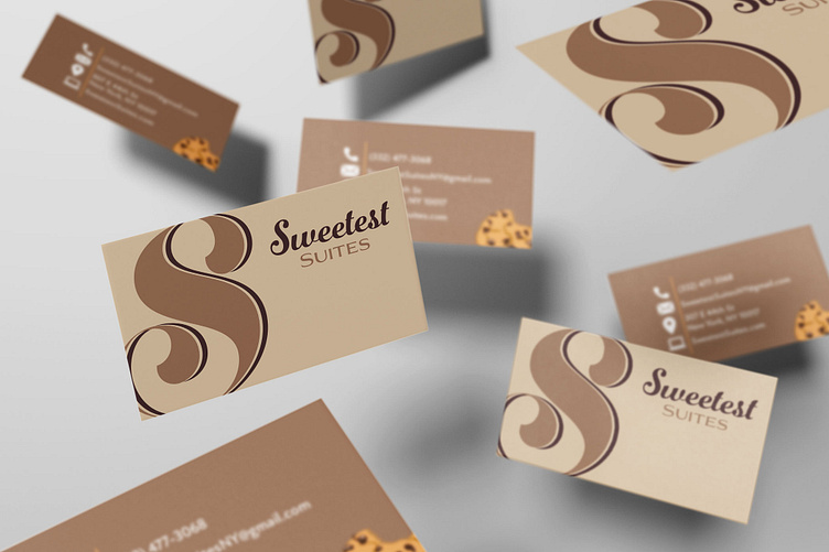
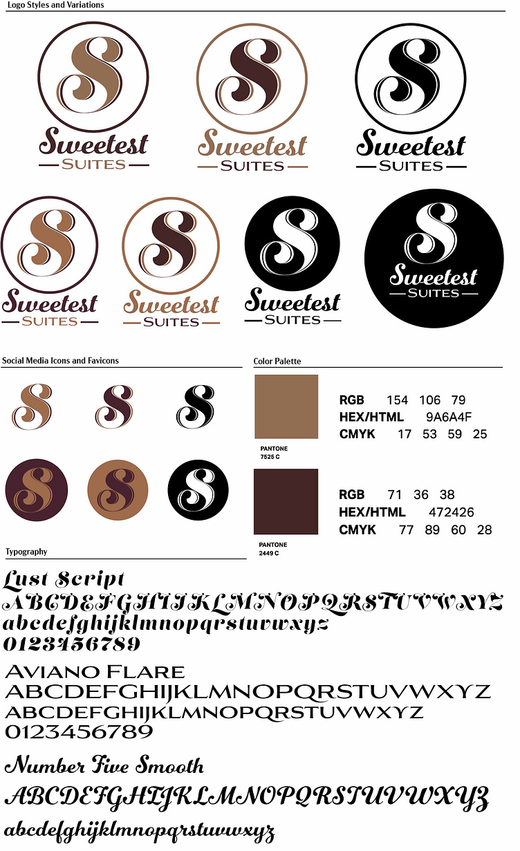
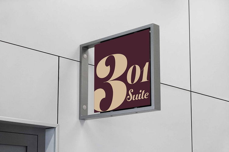
I wanted the logo and color palette to give off the feeling of a warm, freshly baked cookie. The script font that is the logo itself, I chose because of the exaggerated swoops in it. The decorative swash on both ends of the letter have the same shape of chocolate chips. This Lust typeface gives off the upscale style I was going for and it's handmade, which stands for our homemade cookie.
I paired the script S logo with another script typeface and a sans serif typeface. The Lust typeface was far too decorative to read as a hotel name, so I chose a more clear script typeface for ‘Sweetest’ and I made sure it was somewhat similar to Lust. I paired this with a clean and subtle serif so there is hierarchy going on. These typefaces vibrate well together to give off the feeling of a fancy hotel to lay your head and belly.