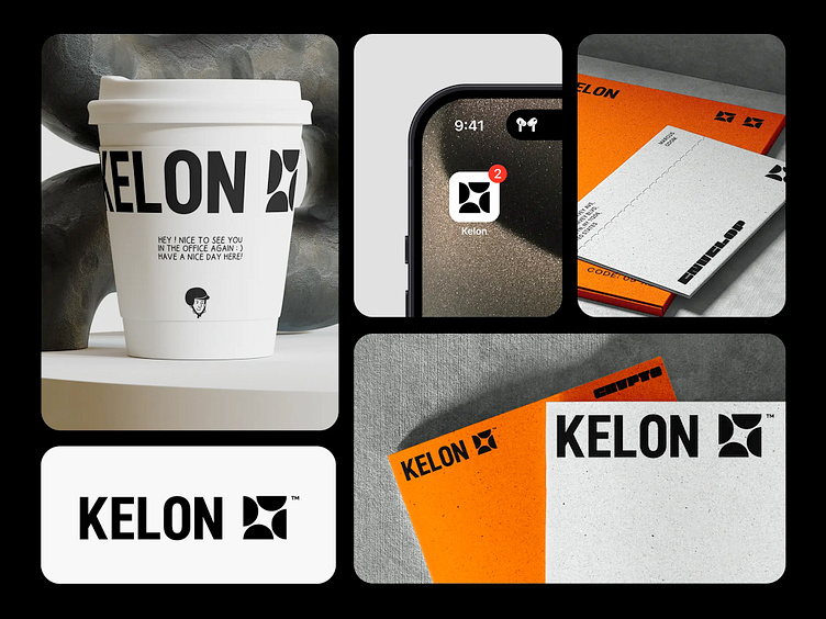
Kelon | Branding | Logo | Crypto-space startup
Kelon | Description
The Kelon branding exudes a sharp, contemporary feel, leveraging a stark black-and-white color scheme punctuated with bold orange accents. The logo is a standout feature, with its distinctive geometric design that evokes a sense of dynamism and precision. It is versatile across various applications, from the casual familiarity on a coffee cup that greets you with a personal touch, to the professional sharpness on business cards and mobile app icons. This cohesive identity reflects a brand that is both approachable and authoritative, ready to make its mark in the industry.
More by Wayone by Vic.R View profile
Like

