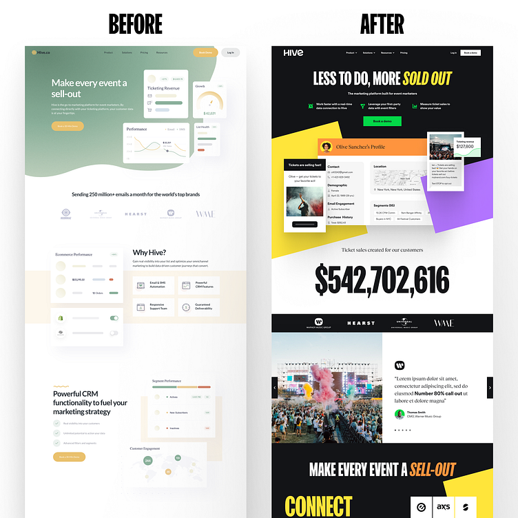
Hive - Before and After
Before and after for Hive!
Key points I aimed to address with the home page redesign:
1. Inject vibrancy into the brand to excite people about their events.
2. Incorporate value propositions into the hero section.
3. Introduce distinct brand textures for enhanced brand recognition.
4. Emphasize ticket sales through a prominent call-out to build trust.
5. Elevate testimonials for increased trust.
Link to the full case study: https://www.brasshands.com/work/hive
Head over to Brasshands.com to see our latest projects
Looking to up your brand game? Email me directly at kyle@brasshands.com
Follow me on
More by Brass Hands View profile
Like
