Navigation Refined
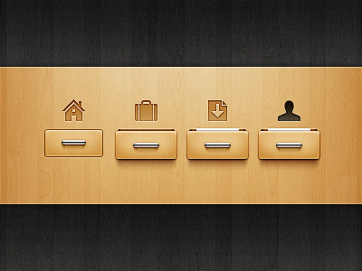
Here's a improved version of navigation I did a while ago.The four drawers show four states: inactive, hover, clicked and active.I selected the opened drawer for hover state because I thought it would make the action a lot more fun.
Most of the changes are subtle and you might need to compare this with the old version to find the difference.You can check this animation to observe closely.In short, I made these changes:
1. Two more states are added 2. Depth is added to the opened drawer. 3. Handles are improved (chrome and shadow). 4. Icons are crisper and better aligned. 5. Radius of the drawer is reduced by 2px. 6. Drawers are sharper.
I hope you like the changes.
Edit: Just fixed the home icon.Check the animation.
More by Asher View profile
Like

