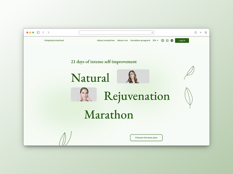
Design Landing Page: 21 Days of Intense Self-Improvement
🎨 Visual Elements:
Color Palette: Vibrant yet soothing hues of pastel blues and soft pinks evoke a sense of calm and freshness, inviting users to embark on a revitalizing journey.
Typography: Clean and modern fonts are utilized to ensure readability and convey a sense of professionalism and trustworthiness.
Imagery: High-quality images of serene landscapes, radiant faces, and balanced postures inspire users, reinforcing the transformative potential of the program.
📱 Responsive Design:
Seamlessly adapts to various screen sizes and devices, ensuring an optimal viewing experience for users accessing the landing page from desktops, tablets, or smartphones.
Intuitive navigation elements and strategically placed call-to-action buttons guide users through the page, encouraging them to explore further and take action.
💫 Engaging Content:
Concise yet compelling copy highlights the benefits of the program, addressing users' pain points and offering solutions in a clear and persuasive manner.
Eye-catching visuals and interactive elements such as sliders, animations, and video backgrounds captivate users' attention and encourage them to delve deeper into the content.


