CACHOCO | LOGO DESIGN & BRAND IDENTITY
Cachoco [Logo and Branding Project]
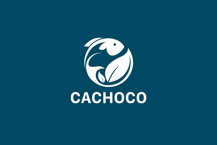
With the message of wanting to convey environmentally friendly canned seafood products to customers, the Cachoco brand logo has designed a fish symbol combined with a leaf symbol. The fish symbol often symbolizes water and abundance, representing seafood. The leaf symbol represents the environment. These two symbols combined with the blue color of the ocean create a significant and impressive logo. Kaiza uses regular fonts for the brand to help keep the overall logo simple but fully convey the brand's wishes and messages to customers.
Designed by Kaiza
Copyright © Kaiza. All Right Reserved
Contact us:
KAIZA CO.,LTD
• P: 0889 996 399
• E: info@kaiza.vn
• W: www.kaiza.vn
Connect me @ Behance - Instagram - Pinterest
More by Kaiza Design Agency View profile
Like


