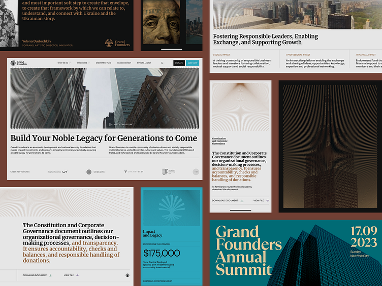
Grand website for an investor club | Lazarev.
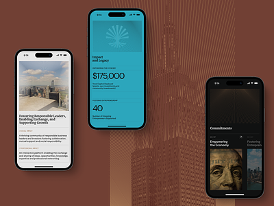
When we redesigned the Grand Founders website, we chose dark, calm, and goldish colors, along with a moiré effect and a simple, well-organized layout. The stakeholders expressed a desire to inject more energy and brightness into the design. 🎇
So we decided to incorporate a touch of blue and green into the color scheme, which mean knowledge and confidence. What are your thoughts?
More by Lazarev. UI/UX Design Agency View profile
Like


