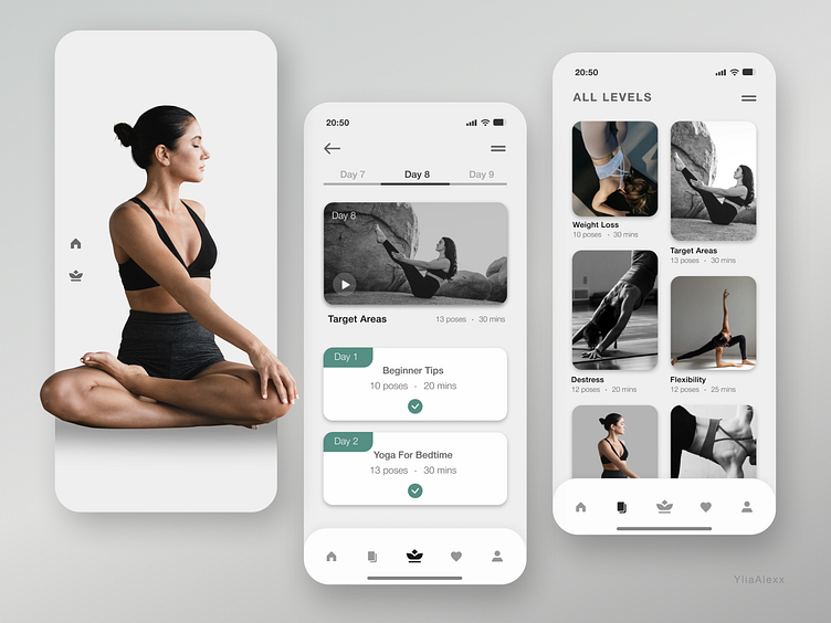
Yoga app design
When developing the design of the yoga app, a color palette was chosen consisting of calm and pastel shades, such as light grey, nude beige and soothing green, to create an atmosphere of relaxation and harmony.
The icons in the app have been carefully selected keeping in mind their symbolic meaning. Lotus images and other elements were used.
When developing the design of the yoga application, two color options were created light and dark. The light design of a yoga app can create an atmosphere of calm and harmony. The dark design of the app may be more convenient for use in the evening or in low-light areas. Dark colors and contrasting elements can help focus attention on the screen and make information easier to digest.
More by Ylia Alexx View profile
Like


