UNWANTED: Estela
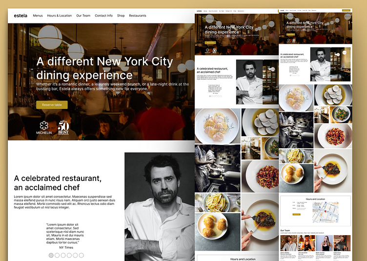
As I stated in my last post, I'm doing a couple of website redesigns just to keep up my skills. This is the first one.
I recently got my hands on Ignacio Mattos' cookbook, and his cooking style seems really down-to-earth and playful. I haven't had the chance to eat at his restaurant yet, my wife, some friends, and I are planning to go in a few weeks.
I decided to redesign the homepage for Estela, which is his first restaurant. I did it quick just to keep myself moving and motivated. Lately, I've been using autolayout a lot, so this was a good exercise for me.
I'm also planning to use it as a project example for Webflow and Framer. Outputting to both systems seems pretty straightforward. Now, I'm curious to find out which one is easier to use in terms of workflow.
I'm pretty happy with the result. Let me know what you think.
On a separate note: Has anyone eaten here?
Check out the prototype here if you want a closer look.
Like always, LIKE it if you like it.
